Brand New Graphic Novel Made in Daz Studio!
 Jay Jay_1264499
Posts: 298
Jay Jay_1264499
Posts: 298
Hi
I've posted about this in another thread but I'm delighed to say that my brother and I have finally finished our new graphic novel made for Kindle and made using Daz Studio.
We made this with a selection of Gen 3 and 8 figures and everything was rendered in 3DL. We then took everything then into Hitfilm Pro for post work such as all the lens flares, screens and various lights along with overal colour correction.
This was a fantastic project to work on personally and really happy to share this with you all! We're currently working on part 2 and also a fantasy graphic novel which will all be made in iRay now we have GPUs that can handle it!
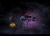
I'e included a couple of images below and also a link if anyone is interested. If you are a Kindle Unlimited customer you can read this for nothing!
The premis is:
A man wakes to find himself alone in a remote region of space with only a malfunctioning synthetic lifeform on board. With only the vast emptiness of space around him and a shuttle in need of repair, he sets himself down on a nearby scientific research station that appears every bit as mysterious as the unknown space around him.
All the best
Jay
Daz 3D is part of 
Connect
DAZ Productions, Inc.
7533 S Center View Ct #4664
West Jordan, UT 84084
Licensing Agreement | Terms of Service | Privacy Policy | EULA
© 2024 Daz Productions Inc. All Rights Reserved.
Comments
Hello J.J.
Congratulations on getting a project 'out there' - I know it takes a lot of work and dedication, and your final product looks fantastic. Well done - and thanks for sharing with the community - it does inspire me to keep plugging at some of the ambitious projects I'm working on.
I just read through the look inside sample pages and you have set up a good intriguing story. Lots of question posed, that will eventually get answered. Good narrative technique. The pacing of the panels works too.
Well done. A lot of work went into this. Congratulations on completing and publishing it. Quick constructive comment; not sure about the choice of font, and the word balloons look a bit rushed. It is important to balance the word distribution within the bubbles.
Thanks for the great feedback FirstBastion, the speech bubbles presented some challenges and I think we've definitely learned a little from this. A lot of thought went into the choice of font/s for the characters. We were really trying to balance the look of a comic with some cinematic imagery with speech bubbles that weren't too jarring. I think this is an area where we are already looking at making changes for future projects, so thank you for letting us know about it.
The word distribution was frustrating at times. The lettering was done in Photoshop and that may have limited us a little, we'll be looking closely at that over the next couple of months.
As FirstBastion said, well-done on getting the book completed and already on Amazon; I zipped through the preview but will download it on the weekend and read it all. The writing is and pacing is great, but the two things I'd offer suggestions for are the word balloons (you should be able to do your adjustments in PhotoShop, as the main issue to me is that the dialogue isn't spaced evenly inside the balloon, some of the text is hitting the upper-left corner for example) and I found the images a little darker than I'd prefer (personal choice).
I'm looking forward to reading the whole book, thanks for sharing.
-- Walt Sterdan
I would suggest using Center justified/aligned text rather then Left when typing out your bubbles.
This link can give you some bubble considerations to think about going forward. https://blambot.com/en-ca/pages/comic-book-grammar-tradition
Blambot also has some free and paid for FONT options.
Great, congratulations... nice job... and exciting I'm sure!!
Thank you wsterdan thats really useful feedback! We had a small test group that took a look at some of the pages before we went live, but after some of the discussions we've had on seeing your comments I think we might post some test pages to this forum next time to get some comments here as as they're very good points! We will defintely take this on board for the upcoming projects, so thank you.
FirstBastion, thanks for the comments and the link aswell, very useful! And thank you for the awesome content you've created too! We will definitely put some test shots here in future to get some early test feedback.
I read the sample and I must say it works great as an introduction to the mystery of the main character's identity and mission. I have a feeling that the robot might actually be some sort of antagonist (or that's my impression considering it was offline), so as mentioned before the writing, plot, and style are all on point! Congrats on getting it published in Amazon! I can tell a lot of love, time, and effort went into creating it and I look forward to reading more once I get a chance.
Now, since you seem open to feedback, I'll reiterate what's already been said about the fonts. I think so far that's the thing that stands out the most. Your bubbles seem crowded and barely hold the text, which causes the reader to feel anxious.
So you'd need to create Negative Space (empty space around the text within the bubble) to help alleviate that unfocused and unintentional tension and help readability.
By the way, the other issue is the mismatched line spacing in the bubbles.
You have to ensure that line spacing is always the same. Since you mentioned using photoshop, you may want to take a look at this here: https://www.bwillcreative.com/how-to-adjust-text-and-line-spacing-in-photoshop/
By the way, negative space (aka white space or empty space) in design and cinematography is as important as any other asset in your scene because it can convey messages and emotions when used correctly. You can learn more about how it's applied to cinematography here.
So, for example, after your main character realizes that he doesn't remember who he is, if you'd used a Wide-Angle Lens for the "damn it, I don't remember" shot to make the scene feel wider and moved the camera in a way that your character felt tiny in the scene, it would give the impression that he's feeling small and vulnerable, adrift in this empty space both figuratively (inner) as well as literally (outer). It would've given that scene a lot more impact and weight. Because as you have it now, it feels almost inconsequential. Like the character literally breezed past it, almost uncaringly so.
Another way negative space can be used is between panels as a transition. Think of negative space as a pause between the panels. So adding just a couple of black, empty spaces between panels can help give whatever comes after a bigger impact, as the reader can mull what they'd just read/discovered in that pause.
Now, a personal pet peeve is regarding ellipsis.
Those should be three dots ( ... ) not two dots. So keep an eye on that as well. Moving on :D...
Last but not least is concerning the leading lines you're creating and the importance of them when it comes to composition.
Leading lines will always draw the eye to a certain place in the panel, so learning to identify and use them will help you to frame things with more impact. Right now, you're getting some jarring leading lines (hard to miss due to the contrast) on the ceiling of the cabin, which keep drawing the eye to places without any payoff.
You can learn more about leading lines in photography & film here.
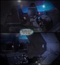
I hope you don't mind that I took some screenshots to better show what I mean. Like I said before, you're already in a great space in terms of look and feel. The plot and writing seem strong and the mystery is well set up. So I hope the feedback I provided provides some good food for thought. The simple fact that you guys managed to create a comic is an impressive feat in and of itself. I admire your dedication and patience to create this wonderful piece!
Morning FenixPhoenix
Thank you for the detailed post and the accompanying links. We really appreciate you taking the time to look into it and also provide some incredibly valuable feedback. No problem either in you using screenshots to highlight your points.
As mentioned above it was strange in that no matter what we did with the line spacing and kerning we ended up with some lanes looking more cramped than others and as pointed out its probably because of the alignment. Going forward we'll probably look at something other than Photoshop just so we don't run into these issues again. Also I think we may use this forum section for feedback while we're in the compiling stage as all the feedback we've had here has been invaluable.
Interesting comment about the ellipsis needing to be 3 dots. I wasn't aware of that so that is really good to know for future thank you!
Really agree with the cinematography comments also. Unfortunately that shuttle while awesome to use did make for some cramped shots which agreed did make leading lines and frame composition more of a challenge. Hopefully you'll notice an improvement as the story progresses.
Camera wise I'll be honest I went with Daz's default focal length, but while working on it I got to thinking about different lenses which I'm looking into for our next project. For this one I didn't think it would be good to start doing that halfway through the story as I think that would have affected the continuity. But yes you're right a wideshot to emphasise the gravity of him not remembering his name would have really sold the shot.
Again though, thank you for taking the time to have a look and the feedback and sourcing of the links has been incredibly valuable and really appreciated. Definitely food for thought!
Thanks again
Jay
Going forward we'll probably look at something other than Photoshop just so we don't run into these issues again.
Not to be that guy, but your lettering challenges have nothing to do with Photoshop.
There are links in this thread that should explain/show comic lettering conventions.
STACKING is the system of 'piling' up the words so they take the rough shape of the balloon they're encased in.
Also, there's usually a space between the text and the walls of the balloons.
And, if you're using photoshop, you should make a TOOL PRESET so that the text is uniform.
You set up your text with all the settings you want....
Font, Size, spacing, kerning etc...even paragraph justification...and then use the Tool Manager to create a Tool Preset. That way when you go to type something, you can choose the preset and have the text be consistent.
I have Many of those. One for the character's speech, one for the narrator, one for technical information...
I also have all those settings written down in a master document.
----------------
A mistake I made early on- was thinking because my book was CGI/3D Rendered, I could re-invent the wheel and be fine.
Ignore all the conventions because I'm doing something different.
Jay Jay,
I was reading a wonderful story called Pale Horse today, in which the artist has an excellent grasp of how to use negative space to build tension and drama. So I snagged some examples to better illustrate my point regarding the importance of using that space which I thought I'd share in hopes that they'll inspire you and your team.
NEGATIVE SPACE FOR DIALOGUE:
A good way to use negative space is to isolate dialogue or go into a monologue (spoken or internal) with great impact. The space between the thoughts or bubbles serves as pause. The bigger the pause, the more tension you create, so the payoff needs to be worth it. Here are some excellent examples:
And just to bring it home, this is the original panel (using the negative space for building tension) vs an edit (what it would read like if there weren't as many pauses):
Now, when you have isolated text, you can use scale and positioning to determine hierarchy. Whatever is bigger will have more impact, so that scale needs to have a proper payoff:
NEGATIVE SPACE WITHIN A FRAME:
Negative space can also occur within the confines of a thought frame or dialogue bubble.
Notice in the example above how there are two thought framed and a sentence that's unframed because it's acting more like narration. Now the first thought frame has a long sentence encompassed by a huge square. This gives a lot of space between the text and the frame, which in turn produces tension since it's surrounded by a pause. You can almost hear it echo in his head.
Then the next bubble is slightly smaller and the text is bigger, which gives the realization more weight. So we have doubt followed by realization; a question followed by a conclusion.
Here's another example:
PANEL COMPOSITION:
Now, this is an example of how a panel can be surrounded by negative space as well, giving the image more impact by isolating it:
BTW, notice how the lines in the graphic below are used to create a grid. Whatever is at the meeting point of those lines becomes a focus spot. In addition, the use of a high-angle shot makes the suffering the character is in more obvious (like he feels tiny or he's facing something difficult that therefore feels oppressive and monumental).
And here we have an example of negative space between narration (which usually happens in the story when the main character is having a monologue while addressing us, the readers) combined with scale to give part of the speech more impact:
WIDE ANGLE:
The following example is excellent to showcase my point about the use of a wide angle to dwarf the character.
Notice how the first panel is a close-up of his face in which he starts his thoughts with confidence. The second leads to a tight shot wherein the character is further confined by the composition (doorway) and he starts to introduce pauses between his words --showcasing he's now suddenly feeling unsure, perhaps even constrained. Then the third panel is wider, he's still framed by the door and then further framed by the walls. He's basically boxed in and he feels tiny. The dark, blue colors show that he may not be as unaffected by the situation as when the scene started. In three panels, the artist managed to convey so many emotions, right?
SCALE MATTERS:
Here's another example vs an edit. This time I'm showing the edit first. Notice how chaotic the scene looks when all the panels are the same size. Vs how well things flow in the original, with the panels with different sizes and positions. It's visual poetry, where the flow of the story moves alongside the panels.
CREATE A FLOW:
On that note, I really like how this set of panels was also composed to show the flow not only of the movement but of emotions as well, as they filter through Pierre's face.
Griffin made a great point about doing a tool preset in photoshop to keep your text matching.
Great!
This is where section planes can come in handy. You can learn more about them in this video. Alternatively, fellow PA Riversoft Art did a product that you might want to take a look at: https://www.daz3d.com/camera-cutaway. It can also be purchased as part of a bundle.
I'm a HUGE fan of fellow PAs' IDG Designs' & InaneGlory's excellent Cinematic Cameras Products and highly recommend them. You can find the first pack here and the second one here. I use these all the time because they are such a time saver.
My pleasure!
Hi FenixPhoenix and Griffin Avid
Thank you both for the replies and also the detailed content you also added here to back up points as well. It's greatly appreciated thank you!
Does that translate into a sustainable venture?
Firstly. This is a first draft. I will not polish it to correct spelling errors so forgive such. But, a big CONGRATS! May I ask how many pages this would be if it were in a paper format? There is a reason I ask. I do have some advice that may serve helpful to you, but without knowing the surmised page count, it would be irrelevant to share and could be unwarranted. But without knowing that answer I can offer some advice.as a fellow author. Why not aim for a best seller and make a North American version? This would mean changing the spelling, the cover and redoing some PS work, which you should do anyway, for your current UK version, based on the lack of white space and the formation of your comment bubbles. There is nothing worst than being accused of spelling errors by US readers because they are unaware that authorise is spelled correctly in Australia etc. The golden rule pertaining to publication is (and once understood golden rules can be broken, but not this one) the spelling and grammar should represent the country that the book was published in, or if a POD product, where the author resides. Considering I moved to the US in 1999 and my first three books are about life on an island that during my childhood, flew the British flag, I should have my books in both UK and US english forms. Another reason would be that over half of my readers are located in the UK. But, I can't at this point in the series. I simply do not have the time to do this. The time to do it is before the first book maintains a forward momentum. I was once number 15,000 is the paid best seller kindle books. I did no marketing because three years prior I tore down all my books (three or so). I had no idea Battered ebook was still up and available. Infuriated, I phoned Amazon and demanded it be taken down. Amazon advised me against it, but it fell on deaf ears. I did anyway. Battered and the first few books were written to appease my bed-ridden huband and send copies to siblings. I unpublished all once I acheived that goal. I thought they were all offline and had no website or social platform for such. I had no clue the book was selling because I used an old bank account I opened for my mother-in-laws funeral expenses and gave that account to Amazon, knowing I'd never sell a single copy to anyone other than proofs for my hubby and siblings. When Amazon said you are getting paid a substantial amount monthly for your ebook, I said, "Really? I'd like to know who you are paying, because it isn't me." Realizing I had a readership (of a draft novel riddled with errors), who were mad at me for not writing the next book, I felt obligated to publish the lot as a serious edited endeavor (or endeavour). I unpublished to rebrand and polish. Once I unpublished and rebranded I fell from an organic success to the rock bottom bowels of the ebookmosphere. It's been a long slow climb back up, but I didn't do it for the money, so I don't care. However, it taught me a humble but invaluable lesson. Write for your readers. Comic fans know their genre. Sci-fi readers know their sub-genres. The graphic releated advice you have gotten so far is very valuable. My first and only carreer in the US was as an advertisinf specialist for a fortune 500 company. A huge company that had thousands of office and sateelite locations the exceed North America's borders. White space and font variations and limitations is crucial to any form of graphics. If you only listen and don't act, to improve your craft, you will not suceed within your genre. And, anyone who puts that much passion, and work hours into creating an ebook, especially a graphic novel should succeed . . . so why not set yourself up for success? Study the craft. Polish your work and although you did a fantastic job, this is the perfect time to make it brilliant and do a repub. But about those pages? Any idea of how many for a 5x7 or an 8 x 11 etc? There is a good reason I ask.
Apologies FirstBastion and ArtAngel for the delay in my response. It'll be so nice if one day we can do this full time instead of having projects at work to worry about
Firstly, FirstBastion we're not sure about the sustainability right now. There are many, many projects currently in the pipeline, and first and perhaps most importantly, we do this because we abolsutely love telling stories. Writing and art is our creative outlet and even if it's ultimately not sustainable then we will continue to do much of what we already have planned. Like many others I'm sure, we hope that it becomes something more but we're also realistic. Hopefully we can continue to improve and your feedback on this forum will undoubtedly be a great help to us going forward. Early signs are encouraging but it is very early days.
ArtAngel i'm sorry but although we are looking at creating the paperback version soon, I don't currently have a page count for the dimensions you asked for. I will try and find that out soon because I'm very interested in a lot of the points you raised in your post. And I was very interested in your comments about your own ebook. I have also published another ebook before as a novel and I know exactly how you feel! I am just in the final weeks/months of the final edit of it after having taken it down off amazon for about two years as I wasn't happy with it. It was written initially just as a bedtime story for my kids when they were little and I would read it to them at night so at the time it really wasn't ready but I felt it was important to take it down now (even though I was already well into writing a follow up) to try and get it absolutely right. Hopefully it works out! Thank you so much for your advice and I will let you know about the page counts soon.