[OUT NOW] Celebrity Red Carpet Environment [Commercial]
 Silent Winter
Posts: 3,761
Out NOW! Celebrity Red Carpet: https://www.daz3d.com/celebrity-red-carpet
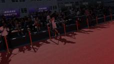
It's 'awards season' with the Golden Globes, Oscars, etc around this part of the year. As the movie stars, fashion models and music icons step out onto the red carpet, the flashes from the cameras and the cheers from the fans fill the scene with the glitz and glamour of celebrity. Celebrity Red Carpet is a complete exterior environment for Daz Studio.
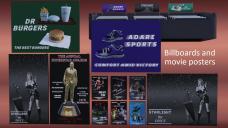
Celebrity Red Carpet comes with a street scene, centered around the steps to The Grand Theater. The carpet sections that run the length of the road, the steps and the pedestrian area can be removed if needed. The set comes with a variety of decorative props, including a backdrop for the stars to pose against with 'Star Pot' prop (2 texture options each), a movie poster (6 texture options), Billboard ad (5 texture options and a 'dimensions' morph), Seating banner ad (3 texture options), seating area with bench (bench has height morph) - See promo pictures for examples.
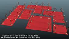
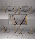
There is a pole with a static rope for normal use and also a rigged rope for special circumstances (3 poses for the rigged rope are included). There are a variety of 'Carpet Pieces' in different shapes and sizes so you can use them to expand this set or use with other sets. See promos for illustration. The carpet pieces have preloads with or without the poles and ropes.
The full set preload has 2 versions. One makes use of Daz Studio instances (so is lighter on resources in Studio), whereas the other does not (making it easier to customize individual parts).
Some promo pics below :)

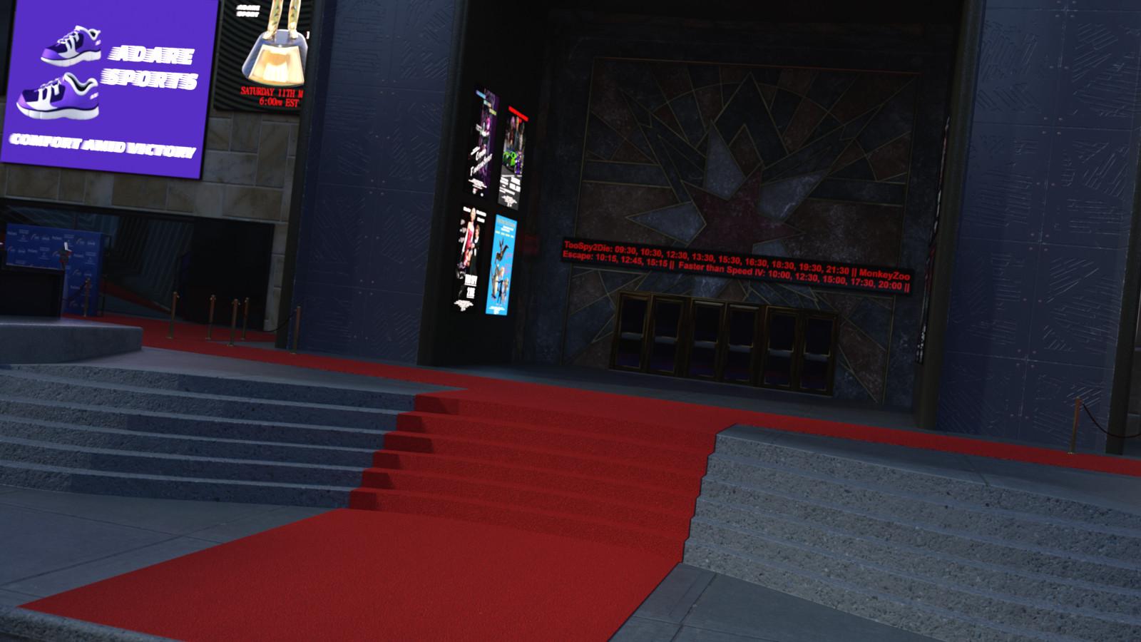


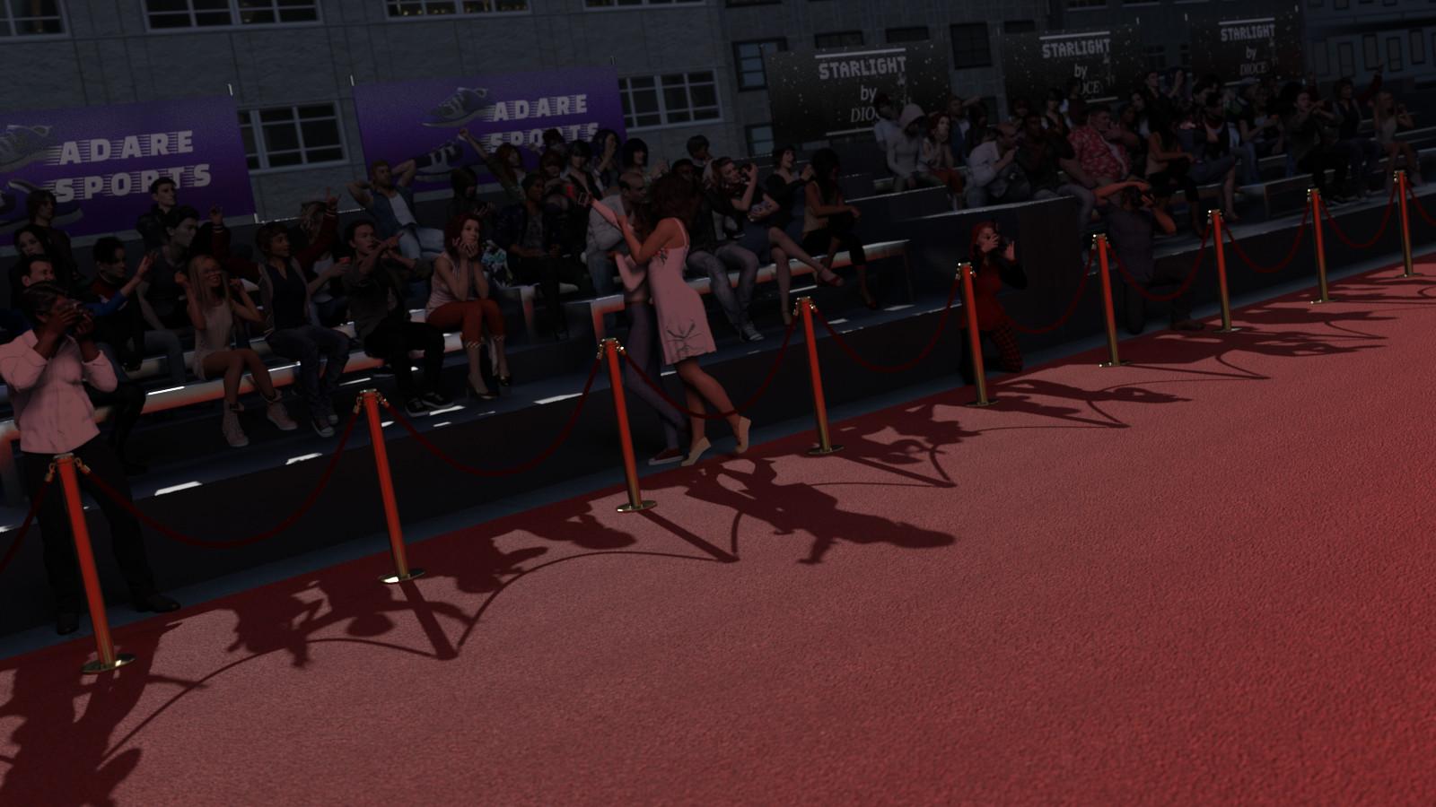










Comments
The images are very dark. It is hard to see the details.
Really? They look okay on my desktop monitor and laptop. Maybe I should re-render some brighter versions then. I'll do so when I have time.
Thanks for the feedback :)
Are your monitors calibrated? Many uncalibrated monitors (and TVs) are extremely bright by default. I hesitated to say anything at first, because I thought it may have just been your artistic vision for the set. Maybe these were supposed to be night scenes. But I decided to speak up, anyway, because I think it would limit sales to have such dark promo images. It would be interesting to see what other forum users think.
Here are a couple examples of what Photoshop thinks needs to be done to enhance monochromatic contrast. Notice how Photoshop believes the original images are very underexposed.
Thanks, I'll look into it :)
The images look ok on my laptop screen - guess, it is not calibrated, as well.
Well, I recalibrated my desktop screen and discovered it didn't need changing. So this may be a case of just my renders being too dark in places.
Thanks for the feedback.
Oddly enough, I just looked at the promos on my work laptop and they are too dark on that. I've adjusted the levels on the attached pics (not rerenders, just levels adjustments in GIMP) - are they any better?
The original pictures passed Daz's review department so they must look okay on their screens. I guess there's no universal calibration, even though there should be, lol.
This is out now! https://www.daz3d.com/celebrity-red-carpet