Opinions Sought on Aiko Attack
 mmitchell_houston
Posts: 2,484
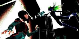
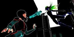
I've been messing with this for most of the day -- compositing different renders in Photoshop -- trying to decide which (if any) I like. So, I thought I'd post these here for some general feedback (and most of the differences can't be seen in the thumbnails, so you should view them full size).
Ver 01: Bricks on the right are dimmer.
Ver 02: All bricks are pretty bright.
Ver 03: No bricks at all on the right.
Ver 04: No bricks on the left (and I added a white outline around the victim).


Ambush_01.jpg
900 x 338 - 43K

Ambush_02.jpg
900 x 338 - 47K


Ambush_03.jpg
900 x 338 - 38K

Ambush_04a.jpg
900 x 338 - 34K
Post edited by mmitchell_houston on


Comments
I like bricks on the right, not sure about the white outline. Nice action shot!
Did my attached images vanish? Weird.
And, BTW, thanks for the feedback. I'm also not sure about the white outline, but I felt it needed something to remove her from the background when I hid the bricks on the left.
KA1: Thanks for the suggestion. I'm going to try simulating a cone-shaped light by applying a mask to the layer with the bricks to see what I can accomplish. In general, I like the angle, severe shadows and creepy blue eyes/glasses on Aiko, but I just don't like the way the pieces all come together -- at least not yet.
Newer version. This needs a lot of work (particularly a sky/background color. But I mainly think the angle is wrong. With Aiko directly behind her, we don't get to see enough of the ray blast.
I like the first version of the scene. My suggestion would be to render the background separately without the spot light & figure in the front. What distracts me is the way the spot light illuminates the wall on the left. Render the foreground character with the spot light and composite it onto the backgound.
So you like the version with the walls all in black? And by that, I mean from the first batch of versions that I did? Not this second one?
I like the version where the sun hits the wall on the left, since it contrasts well with the foreground character. However, the spotlight hitting the left wall and ambient occlusion in the scene just don't fit with the overall aesthetic, imo.
I think it's time to get the first version to work, or drop it. I'll try to revisit it this weekend and if I cannot get something I like by early next week, it's time to move on.
Thanks for all the input!