Install manager - How do I filter the list to see the stuff I bought
I bought five products and after the constant prompting, I decided to try and install them with DIM. DazCentral shows me the five products, and I can install them easily.
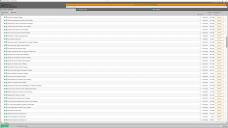
DIM shows me a list of three pages of "downloads" (on a 4K monitor) which combines updates I am not interested in at the moment, and among them, are probably my products. Probably, because I can only locate them in this mess by filtering and for that, I need to refer to the order. The order appears to be random.
Surely this is not the intended user experience? How do I see only the new items and not the updates? I attach before and after so you can see what I'm used to and what I have now. I don't want to to a bunch of updates right now.
(Or am I missing something?)
Thank you :)


Comments
You can change the Sort Order (top right) from "Status: Busy First" to "Order Date: Recent First" and that should help.
I apologise, I am being thick. The updates are at the top and the other stuff is below. An odd order, maybe, but I guess it works.
Thanks you, Melanie
Chiming in here to say that OP's illustrations perfectly illustrate my feelings, and presumably those of others who have protested dropping DazCentral. DIM is fine as a configuration utility that most people need to use once. For routine everyday usage to install new stuff, it's like arranging for a D-Day beach landing to go to the grocery store a block away, during peacetime, good weather and normal business hours, to buy a banana. With DazCentral, one merely opens it, locates the easily identified new stuff, and clicks "Install"; in DIM, you navigate through a busy, complicated and very old interface containing multiple tabs, giant piles of useless clutter for which assorted filters are the only available workaround, and an excessively complicated process just to install a new item - something you do in DazCentral in a couple of seconds, with one click. There are special occasions where one needs to research something or deal with an unusual situation, but when my goal for the next few minutes is "buy cool new stuff-install-enjoy," DIM is a hindrance that lessens my joy. If Daz must get rid of DazCentral pleasepleaseplease do something to make DIM - at least its main screen - look less like troubleshooting a client's software issue in 2010 and more like a modern and simple interface allowing you to spot easily what you want to work with and one click to do what you need to do with it.
What is most shocking to me is that DIM has better search function than the actual DAZ Studio....
I was actually pretty happy with DIM so far for being minimalistic and fast, but while It could use some more categorization (and dear God in the sky does DAZ as a whole could use a TAG system) it definitely is of concern to me me all that soft Add bloat that started to creep in....
Exactly how I feel.
I tried hard to keep opinions out of my original post in case I was doing something stupid, and indeed I was. BUT, as someone that's heavily involved in user interface development, I can say that while it was user error, the user interface is poor and it guided me towards the error. I'll explain. What does the user care about the most? What they've just bought. So why isn't it at the top? You put what's most important in the most obvious place. Basic stuff. I shouldn't need to scroll through 150 products to find what I want.
Pictures have gone. Pictures are important. Without them, I need to read text and that takes time Why do I care? Because I have uninstalled things, or chosen not to install other things (e.g. Genesis 1,2,3 and 9). When I only have five new products, it's easy - I want the first five (in the second section). On Black Friday, it's going to be harder to work out where what I want ends and what I don't want begins. I'm going to have to remember product names and read descriptions. This is one reason why pictures add a lot of value. They also look nice, and that, in a package designed for creating art, is important. First impressions count.
Again, as someone in the industry, I will say that DC looks like it's designed by people that understand UI/UX and programmed by technical people. DIM looks like the technical people did everything. Very few technical people can create a good user experience. As a consequence, DIM is not what the modern user expects.
If I must stop using something that does the job very well, and start using this ancient thing, then I hope it's going to get some love from people that understand how to think about what their users want and create something that prioritises those needs. Or just do what DC did, That was good.
Puting updates in their own section is surely useful, it separates the new version of soemthing you have already downloaded from the stuff you may have deliberately skipped downloading.
DIM doesn't (yet) have a Grid view like Daz Central, but it can have pictures (replacing the geenric icon, and showing in a pop-up tool-tip when the mouse is hovered iover the item) - select the irtems, right-click>Retrieve Thumbnail.
Thanks Richard. I realise it's early days for the replacement. I suppose sometimes I can't leave the day job behind when I see something I feel could be improved...
Speaking for myself, I'm an old, cranky software support analyst by day; I can never really turn it off.