Looking for opinions on some of my first serious artwork
in Art Studio
Hey guys and gals,
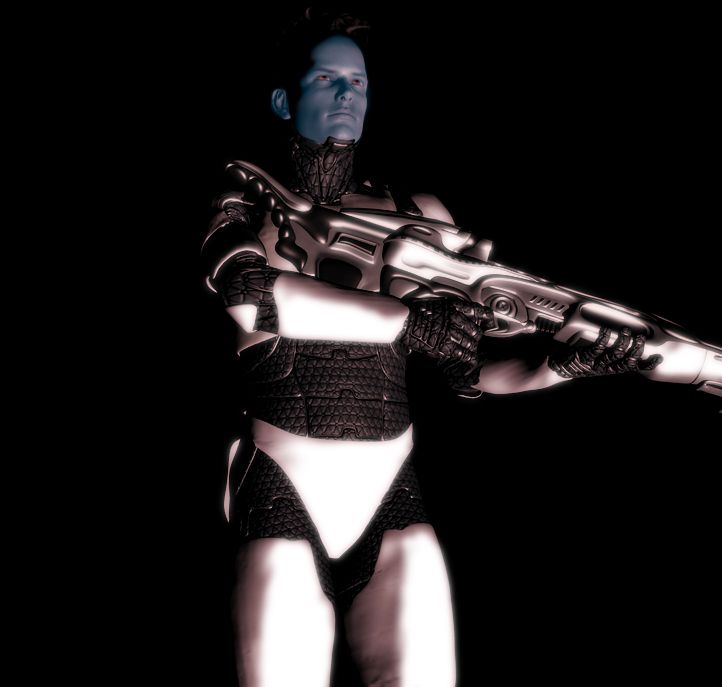
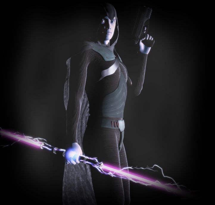
I made these two images recently and am looking for some feedback.
1) Ondre Bersson, Grey Knight
Programs used:
DAZ 3D
The GIMP
Files used:
Genesis 2 Male
Legacy 5 Shapes for Genesis 2 Male
Assassins Hood by adamthwaites
The Sith Lord outfit and dualsaber by EvilEliot
Nightguard Cloak for Genesis
Orestes Electromancy
2) Kato Holleri, Sorian Elite Commando
Programs used:
DAZ 3D
The GIMP
Files used:
Genesis 2 Male
Wildmane Hair
Nano Suit for Genesis and its laser rifle
Classic Forward Recon Armor for Genesis 2 Male (This is a custom set of armor I made in Hexagon. It is based on the Star Wars the Old Republic armor of the same name)


Comments
First render rocks ! Very cool saber affect. Like the 2nd render to, but bluish face appears out of synch with overall render color, otherwise great job
Really good starts, for early renders. The 2nd one, too much contrast the lighter colour just glares out at the viewer. Both would be better if the figure was moved to be less obviously dead centre, although it is not so crucial on the first one. The second one he needs to move to the viwers left, so that whatever the weapon he is carrying is, it shows fully, instead of going out of shot. The light seems a little off as well, thee bottom half of the images is lit more than the very top, so you are losing detail there.
Unless he's supposed to be a blue skinned race...in which case, it may be a little too grey.
I know my opinion doesn't really matter cause I am a newbie but I am going to give it anyway, I think they are a little too dark in the background cause you do not know where the darkness ends and the clothing begins, and I agree with all the others in saying the second pic he has too blueish grey face, also the second pic his legs are way too bright compared to the rest of his body.
There is my 2cents worth now you can ignor me
I took the liberty of some fairly aggressive "redlines" on your first image. I hope you don't mind. I like it a lot, so I think this feedback may help you to develop it (or another like it!).
Direct link (in case that one doesn't show or enlarge when you click it): http://i.imgur.com/eLUuNS1.jpg
Thank you. Nice work so far! I like the lightning on the laser bo staff alot. Very nice touch.
~JigSaw
Thanks for all the feedback! I will certainly try to go back and make them better!
JigSaw73, your photo and comments educated me in detailed position. Thanks.
As for photo treatment, I would recommend less glow in your glow, for a more professional feel. Add grain/noise just a bit, almost nothing.
Eyebrows: always set the eyebrow dials of your characters, whatever the pause, so it transmits the attitude of the character and look even less 3D. Or add 20%-30% of one full facial expression. The exstensive and careful use of the eyebrows will change everything in your animation or still. Example, pay attention to the eyebrows in the following video: