(minor) update on progress with 'The Library' and area lights
 Roman_K2
Posts: 1,239
I'm still looking for a magic shortcut to my problems with Jack Tomalin's "The Library" and the area light presets, heh. Earlier I was getting a rough, concrete-like surface on everything. I've knocked down some walls to save memory and some things aren't rendering too badly in 3DL, although in trying to put Everyday Drinks on the table I seem to have called up -- or it calls up -- incomprehensible "Iray only" shading routines, which for me is not good. Perhaps that product ought to come with a warning, or am I missing something? I have some of the other "Everyday" stuff and it renders fine.
Anyway, to keep things simple in The Library for the time being I'm using using only one light preset at a time.
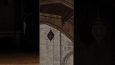
Here's a look at how one of the chandeliers is coming. Left image = one area light preset only (unless I'm greatly mistaken) and rendered in 3DL. Wow, dramatic fall-off on the parquet flooring, for sure!
Center image = the same scene using just one regular distant light up in the rafters. Right image = close-up of the first scene via a much-larger render. I figure I'll try to stick with just getting this illuminated until someone suggests otherwise. Currently reading the thread at http://www.daz3d.com/forums/discussion/14536/tutorial-uber-area-lighting-the-basics/p1 and trying to remain focussed.


Comments
The Everyday drinks are Iray only - the blurb does note "Compatible with: DAZ Studio 4.8 or higher. Iray materials only - 3Delight materials not included.".
Remember that the plceemnt in space of a distant light doesn't matter, only the direction in which it is facing.
so what problems are you still having, apart from buying Iray only stuff?
I can't believe I blew it with the glassware, thanks.
Nothing that's really ready to be discussed. (To be fair the tutorial on area lights is 19+ pages!) I'm just trying to pick one light "source", like the chandelier (which is repeated down the length of the room so it may not be the best test subject) or the fireplace point light. Then I have to render the same scene four times (since there are four light presets, correct?) to try and examine the differences.
Every now and then during these long, hot renders on my laptop <DUCKS> I try and throw some something in to see how it behaves. The drinks and glasses were a bad idea, obviously; here's one where I tried the xmas tree. At least if I turn on at least one distant light, some or a lot of the rough concrete effect seems to go away. The shadow in the back room is 3DL but the strange ray of light in front is just me, fooling around. Note the light in the top left corner which must be coming from holes I've left at the other end of the room.
The part about distant lights having a direction only, and their placement is irrelevant (?)... that's something that's going to take me a while to wrap my head around.
It is quite simple really, although I must admit that I was a bit baffled when I started with DAZ Studio. A distant Light represents the sun, which is 98 million miles away, so it doesn;t matter where you place the actual light, just use the arrows in the light icon to determine what direction the light is coming from. Some people put several of them in a scene at 0,0,0 and leave them sitting on the floor and change the rotation to get an all-round light effect.
Hope that helps a bit.
Direction, in this case is both angle from the horizontal and the way it is pointing...the elevation doesn't matter, neither does forward/backward. In terms of the axes...rotation around X and Y are all that really matter. Transform on X,Y or Z is pointless.
well the relevant info is all on page one
Ok, I might be getting it now... a distant light is like it's coming from the sun, eg. it's a REALLY distant light. Gets a bit complex with models like the DAZ Shark say... most people will want to try some distant light coming UPWARDS in the otherwise dark water, onto the shark's belly, and probably with some rippled gel effects as well. In this case (underwater shark scene) the "distant light" is definitely coming from below and not from the "sun".
I have just now read someone mention IBL and scene lights (sic) and it's happening inside Iray. So much to learn!
Yes, very interesting for you to mention that, ("0,0,0") as I was imagining the same sort of thing in my mind's eye, and thinking 'did I want to move each one over a bit' so as to help differentiate them in the scene... new concept for me, having them all in one place on the floor.
So far with the area lights I have at least confirmed the existence of the settings like "Fantom" and "Falloff"... got 'em right here on my computer.
When you import Dreamlights "canyon extension" model there are a bunch of lights including a "Sun", giving an all-around effect such as you mention. Is Dreamlight's "Sun" in the canyon extension something special I wonder, or...?
no Dewamlight's lights are just standard Distant lights. If you go in to the Scene Pane and click once on the name "Distant Light" you can rename it which is what Val (Dreamlight) did.
My one frustration with distant lights in Iray is that they are absolutely razor-sharp shadows. To change that, you need to put up some diffusers in the way.
But... if you are going to do THAT, you may as well just use off-screen point or spot lights to do the same thing...
I dunno, depends on what you want.
I'm getting it now... also the Iray render is a sort of cumulative process - the grainy image at the beginning of the render is not the finished product.
I am amazed that this is as "photo-realistic" as it appears to be going. The fruit looks good enough to eat, and I'm doing this on a fairly low-end computer.
I wonder what the little piece of somethingerather is, just to the left of the glass? Some residue from the ice cube maybe, that I put into the tumbler?
The white spot looks like a caustic from light shining through the glass.
nicely OT but looks good so far Roman
Heh heh... you want to know what it was? It's two ice cubes, one a bit bigger than the other. I had probably clicked "ice cube(s)" three times before I realized or remembered that it would have to be scaled up, on the default DAZ screen, or maybe it's my "stock" Background Deluxe* scene file where I had cranked up the BG real big, years ago. Anyway first time with the ice so two little pieces got left outside the glass <grin>. Live and learn.
Anyway this (Everyday Drinks) is the sort of model that I can probably include in "The Library"... I don't mind a little postwork.
*Background Deluxe was an older model by "Nerd3D" that's no longer carried by DAZ. Nerd3D was the guy who did the "Thunder Canyon" animated car video IIRC. Like "401 - The Movie", TC was a bit of a milestone in my opinion.
I did a few more with Genesis and the stock red jacket, and while I achieved the shiny "wet" or "patent leather" look with that one, all of my Iray renders seem to cut out at varied times - none completely finish removing the "grain" effect or process residue.
Some fantastic subtle shadows in The Library with Iray, things that I might want to pick and choose with postwork, but again it's hard to tell what adjustments cause which special effect.
Is there any special relationship between the "area" or mesh lights, and including/not including Distant Lights and using/not using Iray? Just as an example, when you use Distant Lights with 3Delight there are some basic lighting color and intensity adjustments that you can make, and you can play with the shadows and so on but selecting "Iray" as the rendering engine seems to make those control options go away, and if there is something that replaces them it's lost on me what that might be.
Also, getting the odd error message here and there, things that mention displacement information, for example with Merlin's "The Church" but also with "The Library". Big issue to worry about?
I see that putting in/taking out distant lights creates lots of issues. I've had both sharp and VERY subtle shadows, in particular in one of my renders there was a *fantastically* subtle Iray shadow on the bookshelf. But the glass windows in the book shelves are out of this world and I'm having great fun playing with firelight and putting in/taking out some shadows behind the armchair in this postwork piece. The dog layer is a 2D cutout of a *real* picture of a dog that I took on my own, *real* carpet.
One of the most subtle things I encountered was having a bit of firelight reflected on the bookshelf walls (say) and having this ambient glow if you will glinting on one side of the ebony piano keys. Looks like a postwork job to me -- stripping in slivers of light, one at a time.
I find that some of the hard, sharp shadows are useful as a sort of guide or reminder of how the computer "sees" or computes the 3D space. Lots of rendered attempts produced really dark shadows under the piano and stool, and in the corners of the scene, stuff that's on track with it being a firelit scene. Only Iray was able to capture really soft reflections of the window glass, onto the seat of the armchair... things that wouldn't even have occurred to me as a fine artist doing a traditional oil painting say. Anyway lots to think about.