What lighting to make skin, eyes and hair look good?
 Riggswolfe
Posts: 905
in The Commons
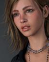
I've spent a lot of time experimenting with shaders and textures and such but I'm starting to think lighting is my biggest issue remaining. So, see my question, what lighting do you find really makes skin and eyes and hair look good? I've included a picture someone rendered and posted on, I think, the Daz subreddit. Any advice on how to get this kind of good looking skin and such? I know the texture itself has a lot to do with it, but beyond that I'm curuious what lighting people use.


Amelia.jpg
640 x 800 - 86K


Comments
I've posted this short video test I did a while back. Using the default lighting HDRI, exact same camera setting, and 12 different character textures available herein the store. Textures AND lighting together give you the results.
https://youtube.com/shorts/pBoypmuFps8?feature=share
You might get some ideas with this thread too. https://www.daz3d.com/forums/discussion/664791/please-let-me-see-your-most-photorealistic-render-using-only-the-sun-sky-system-or-default-hdri/p1
Look good in what context? There are lighting sets available like BOSS Pro that will quickly give you great portrait lighting, but you also have to consider the scene you're rendering.
I have to admit that as a sorta-newbie, I have bought a huge number of light kits, perhaps even most of the reasonably modern light kits in the Daz store, and it's not entirely self-evident how best to use them.
Wasn't this image posted fairly recently in the Amelia 9 thread here? You could try just asking the artist about their light setup. For what it's worth, this looks like it was lit with a large white key light around neck-height to the figure on the viewer's left (catchlights aren't always indicative, but this may be the light you see reflected in her eyes. If so, you can see that it's actually at least two lights, or some sort of funny shape on an HDRI), and at least one fill light on the viewer's right, plus probably a couple of other fills and some grey ambient light. Using large lights tends to produce attractive results with the PBRSkin materials G8.1 and G9 DAZ Original character ship with, which can look plasticky under point light sources.
For light similar to what you posted, I would try the free hdri's by second circle (renderosity) and intheflesh (renderhub). You can also try Beautiful Neutrals by Quixotry, here in the DAZ store.
More generally, I enjoy lights by Dimension Theory, ElianeCK, and PixelTizzyFit. But I tend to go for more colourful lights than what you posted.
I'll definitely watch this video, thank you!
I've actually expertimented with Boss Pro. A lot of my renders are indoors with characters in sets. And I just really struggle with getting good looking skin and eyes consistently.
See, I didn't even know this about using large light sources. I tend to use spotlights and HDRIs a lot. What about UBR skins? Is it the same deal?
Camera vs Perspective View
Make sure you always use a proper camera you add into the scene. Never use the default perspective view for rendering.
Focal Distance
Also make sure the focal distance of the camera is set. Each time you move the camera around escpecially when zooming in. Once you frame your camera how you want it, switch to perspective view and click on your camera. As you slide the focal distance you should see a marker to highlight where the focus point is. You want that marker somewhere on your character. Then switch back to your camera before rendering.
Disable Camera Preview Light
Make sure to disable the preview light coming out of the camera. Each time you add a new camera to the scene, by default it will have a preview light. In the cameras properties you can disable it. Having the preview light on will ruin the skin in most cases. If you disable the preview light on the camera and the scene looks pitch black when not in iray preview mode, that means you turned off the preview lights for the "camera". If you want to toggle on preview lights (different from the on on cameras) that wont affect your renders so you can see what you are working on, press Ctrl+L. This wont affect the actual renders the way the preview light on the camera will.
Spotlights and HDRIs can both provide this type of light! In fact, most HDRIs provide light with big bright patches, either a literal photographic sun or something that approximately mimics a softened lamp. To change a spotlight's size, change the "Light Geometry" dropdown to something other than "point" ("rectangle" is straightforward) and adjust height and width. A lot of people use meshlights for this purpose -- a mesh light is just a primitive with an emissive material. They can be preferable to spotlights, for performance reasons and because spotlights behave kind of weird sometimes in Iray.
Edit: To answer your last question: probably, but I jumped ship for PBRSkin long enough ago that I don't remember my Uber tricks. To be clear, the name of the shader DO Genesis 8 characters used is Uber, the German word. The name of the newer shader, PBRSkin, is based on the acronym PBR, for "physically based rendering", the material workflow used by Iray and most other modern render engines.
Wow, I completely forgot about the camera light. This is really good advice. DAZ Studio calls them headlamps -- every camera has a headlamp section in its settings. Their default mode is "auto", so you can turn them all off forever by going into your render settings and changing the "Auto Headlamp" dropdown to "Never" (... which is why I forgot they exist). Headlamps can be useful sometimes, but they can make renders look like flash photos taken with a handheld camera, which looks super unnatural in almost any render that isn't specifically cultivating a flash photography look.
If I'm not doing the lighting myself with emissive planes or the sun/sky, I use the photoshoot lighting sets from joelgecko. And actually, when I buy a new character, to test it out, my go to is HDRI 23 from the first photoshoot set. If I know I'm comping the character into a background that I'm not rendering, I find a light from the photoshoot set that matches closely to how the setting is, and generally you can find something that will work. I can't recommend the two lighting sets enough.
And I agree, never use the headlamp, it'll take away any of the details that would come out with the lighting.
I always turn off the headlamp on cameras. Now, that said, I didn't know it's a good idea to set the focal point on the figure at all times. I do it if I turn on Depth of Field in the camera but you're saying to do it even without DOF? What about fstop? I sometimes turn it to 50 because I read somewhere that can be better for portraits and such?
good suggestions, both.
I've seen some people still prefer the Uber skins because supposedly it can give finer control of some elements like SubSurface Scattering? Any thoughts on that? Do you think PBR shaders are truly superior?
One of the spotlights I use a lot comes from the Render Studio scenes product. It has a light set called something like Skins Subscene and that has a spotlight in it that is setup to be a specular eyelight. It seems kind of useful though it doesn't always give me great results. So you think emmisives are superior to spotlights for lighting a scene?
Beuaitful neutrals purchased. :)
For the focal distance, not sure if it makes it necessarily better, but I definitely notice a difference to lighting when I adjust it. I believe sometimes if the camera focus is way off it impacts lighting. As a test zoom super close up onto a characters face, then see if you notice a difference by simply resetting the focal distance value to default as a start. In my case I notice a different result to the overall look. I believe this mainly affects certain scenarios when you really move the camera far away or super close.
Also someone clarified my point on disabling "headlamps" instead of preview lights.
When I say things like "can be preferable", I'm being super literal. Meshlights CAN be preferable to spotlights, but they aren't objectively better in all situations.
Same deal with PBRSkin vs. Uber shaders. I, personally, think that it's very easy for Uber skin shaders to look waxy out of the box, and their terminator can be extremely hot even in lighting that isn't that intense, which I don't like. PBRSkin shaders look more appealing and believable to me out of the box when lit the way that I like to light characters. You might get very different results as you get a handle on how you like to light your scenes, or you might just have different tastes than I do. (Or not. I mean, this thread started with that Amelia render, which I think has great-looking skin too.) Uber skin shaders can look really dewy, which is very pretty but not usually a goal of mine, for my own art. That hot terminator reflects some trends in 2D art that might be to your taste. I think it's a good idea to look at a lot of art and promos, ask people how effects that you like were achieved, and experiment. (The other answer is that I prefer to render in Blender these days, so take all of this with as many extra grains of salt as you feel appropriate.)
A mesh light can be made in different ways: a splotlight with non-Point Light Geometry as well as bigger values in Height & Weight... or an emissive Primitive with proper size. Meshlight is usually used to soften harsh shadow edge... if you need the effects of high key, low lighting ratio, better use mesh light, like the example screenshot you posted.
Buying light products is a shortcut...but after analyzing those products with more experiments, one day you'll find: in most cases, using a good HDRI as an ambient light + a well set two or three point lights can always bring you great result in terms of lighting. Better learn some good lighting patterns and photographic techniques, and flexibly use them in your scene...
As for Iray Uber Shader and PBRSkin, I would say the former is a universal shader that you can use on all types of surfaces, while the latter is purely designed for Skin surfaces (starting from G8.1) that may bring you more options on surfaces settings as well as better VE. However PBRSkin shader may require more texture maps as well as knowledge and techniques in terms of a good setup, so still, learn the settings from good character products and experiment with your scene and preferences.
Personally I'm not a fan of the PBR skin shader and I suppose that is because I trained myself on setting the lights fitting for Iray Uber (aside from it beeing too continuously same)
I have the impression the two need very different light settings to look good
and it's one of my major reasons I don't use pbr skins much since for the comic I have all the character with Iray uber, mixing them in one image really doesn't work
So what are the best version of light settings. honestly it's a lot of experimenting and varies for different situations very much
The already mentioned BOSS lights are good for studio shots, then there are some HDRI which work really well, though I often ad an emissive plane soemwhere to create fill lights
for sunny scenes the sun sky ony works with the sun intensity dialed up
you can experiment with different HDRIs (many free on polyhaven and other HDRI websites). It is easy to save them as presets once you load the HDRI map image, then can cycle through them in future from your content library.
If skin is looking unrealistic in most lighting conditions, then this likely means shader and textures need improving. There are many tutorials about adjusting the PBR Skin and Iray Uber shader for more realism. Often vendor's out-of-the-box settings could use some adjusting.
It should be noted that despite the word play, the Uber shader is also physically based rendering (PBR). So both the Uber and PBR Skin shaders are technically "PBR".
I used to think this, but I've learned to work with the PBR Skin shader and I am now able to get good results with it. The biggest issue I've run into is that most characters out of the box use the same SSS settings from years ago with the introduction of the Uber shader. They don't work anymore and tend to produce orange people. But it is easily fixed with a few simple tweaks. You just have to play around with it. Here are some examples of very simple tweaks I did to characters out of the box -
If you're doing mainly portrait type stuff try Photography Masters
Your struggles to get consistently realistically good eyes, skin and hair is most likely not due to the lighting you use but you using the skin, eyes, and hair under lighting conditions that reveal the original short comings of translating a 3D character into 2D for use on a 3D model. That translation will only look realistic for the same lighting and camera angles that the original 3D character to 2D 3D character translation was taken from and so soon as you stray siginificantly from that, the illusion is shattered.
I like the BOSS Pro set mentioned earlier - it is the fastest & easiest to use.
BOSS Pro Light Set for Portraits & Promos | Daz 3D
CLASSY: Cover Photo Light Set & Vignette | Daz 3D
For extra cinematic type drama I like Colm Jackson's sets. They are more difficult to use than the BOSS Pro sets though.
Render Studio Iray | Daz 3D
Render Studio Iray 'Scenes' | Daz 3D
Render Studio 2.0 - Volumetric Plus | Daz 3D
Render Studio 2.0 - Production Scenes | Daz 3D
Cinematic Light FX plus Atmosphere | Daz 3D
Now that you've reminded me, I wonder if it would be a step up in ease of use and dramatic realism for Colm Jackson to make a new iRay lighting set(s) for volumetrics and CineFX now that DAZ Studio and iRay support volumetrics directly. He could add smoke, fog, rain, snow, fire, clouds, and man-made embellishments in those environments that use those effects.
I really like your results, MelissaGT. What are you generally doing, toning down the transmitted and SSS colors?
Great thread, please keep'em going with the tips on lighting.
I use ghost lights (https://www.daz3d.com/iray-ghost-light-kit-one) when I have trouble with eye shadows etc. For eyes, I scale one down to like 10% and set it to 5w and put it close to the eyes. 40-60w ghostlights around the head to light up the hair.. It's simple and I am happy with the results. Compliments to KindredArts and the light kit above, I use the heck out of it.. it provides a scale acurate representations of the light source and a direction arrow to help you place it.
...for character design, particularly when creating skins with Zewv0's Skin Builder and seeing how both custom and premade skins react to different light settings I use these:
https://www.daz3d.com/fast-production-lights-for-iray