Requesting Critiques for New Book Project Images
 3141592654
Posts: 975
Good day everyone, I have taken on a new book project ... it is broad ranging in themes [ religion, science, philosophy, mysticism ]. Many illustrations will be made with Daz Studio. Some of these topics are outside my area of general knowledge and I am thinking of posting things here for critiques on what is missing, wrong, or could be improved with the content of the image ... or even other ideas on how to present ideas. I am not so much asking for help with actual rendering techniques as style, size, and other options are limited by publishing criteria.
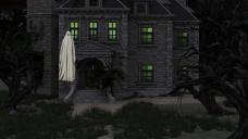
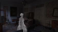
I include these first two images a a sample - it deals with a stereotypical ghost made by a sheet with eyes cut out vs a slightly more 'realistic' version of a ghost. I feel like even the second image is a bit 'stereotyped' ... but I am not sure where to go from here. Thank you in advance for suggestions.


Comments
Not sure if this is the type of feedback you are after, but as no-one else has replied yet I thought I'd give it a go.
For the first image, it may perhaps be best to put the "sheet ghost" in a pose that signifies movement a bit more? I know that a "floor" is not really relevant to a ghost but I think when a ghost is floating in the air you would still usually see slightly raised arms or something rather than being in a more static standing pose.
For the second one, I think perhaps maybe adding a little emission to the figure may help? Not too much but maybe just enough to give it an eerie aura of some kind.
Iray is bad with transparent ghosts because it doesn't hide the internals or backside... I have done similar to the second one by rendering the scene first without the ghost and then again with a non-transparent ghost. Then I have taken them into PS and overlayed the one with the ghost on top of the one without and applying the transparency there.
Oooh ... movement and emission ... nice ideas ... thank you.
Hmmm ... overlayed with transparency in photoshop ... this might be a great place to use canvases ... thanks for the idea!