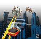
WIP - SF Superhero Battle Scene
 mmitchell_houston
Posts: 2,484
I'm working on some illustrations for a Sci-Fi inspired Superhero Role Playing game. Mostly I'm doing illustrations of gear, vehicles and stuff like that.
I'm shooting for a look that is inspired by old comics, but doesn't necessarily duplicate them.
I would just like your reaction to this, and if you can make any suggestions (I'm not in love with the colors on the attacking mech ships, but finally had to call it quits and move on).


_City_Attack_Final_2000px.jpg
2000 x 1929 - 1M
Post edited by mmitchell_houston on


Comments
Nice. I like the offset lithography elements.
I agree with Teofa, that colouring tecknique is really cool and gives a feel for the story.
I really like this. I'm not sure what it is that you don't like about the colors of the attacking ships, but they seem to work as far as I can tell. The only thing I would ask is why the texture dots are so big on the buildings. Have you tried smaller ones? It just seems like the vehicle in front being attacked should be the focus, but the larger dots on the buildings keep distracting my eyes and drawing me there. I like the texture pattern on the front vehicle. Just curious if that was intentional or if I'm actually suppose to be more drawn to the buildings. Since I'm not sure of your process and I don't do comics much so you are definitely the expert there, I don't know if it is even feasible to change that without changing the other stuff because all of the other stuff looks dynamite.
Knittingmommy: I don't have a specific thing I dislike about the mech colors. They are definitely good enough, but I'm just not in love with them
Good question about the dot size. That had actually crossed my mind -- that maybe the building dots were too big and might affect the sense of perspective. I think the reason they wound up so big is two-fold: 1) I wanted the buildings to be very abstract. 2) The buildings were originally smaller, but I blew them up a LOT when I decided to change the composition and scale of the illustration.
I'm going to think about changing them (I can make it happen -- it's a bit of extra work, but not impossible -- everything is in layers so I can change the shapes and the colors fairly easily). I am on deadline, though, so I may just leave them alone.
But I'm definitely going to think about it.
NOTE: For some reason, this image just kept growing in size, both dimensions and file size. The dots are hard to work with at small sizes, so I kept blowing things up more and more and more... until I wound up with an image more than 8,000 pixels wide, and 1.8 GB in file size. That is ABSURD. Most of the file size came from many unused layers stored in the document (the car was originally blue, the buildings were brown, etc.). I finally went through and cleaned out the unused layers. That actually cut the file size in half. And, of course, I shrink the image down when I post it and send it to the editor. But the actual image could print a poster that was 26 inches wide. The other images in this series are not as big.
I could actually see that as a poster one of my boys would love. Overall, I think it is a great picture.
Thanks! Now, if only the editor of the book likes it!
BTW: If anyone's interested, I've got another image for the book posted over here. I'd love some feedback on it, too.
http://www.daz3d.com/forums/discussion/64940/wip-opinions-sought-on-comic-style-illustration#latest
I really like the way you've done the ships and the buildings. It's a great dynamic picture! The only thing I'm not really in love with is the sky, which even though it's dualtoned, is rather flat in comparison to the foreground.
ScribblingSandy: The sky is one of the last things that really bugs me in this illustration. I tried a few other things (clouds, blue sky, just leaving it white) and nothing worked as well as this simple black. Everything else wound up competing with the foreground, or just looking too different in style to blend well. I would be very open to any type of suggestion from anyone on something to try.
Hmmm. Have you already tried placing a few fine parallel lines along the edges? I think it really just needs a little something to give the sky a bit more depth. Something like this, perhaps? (It looks terrible because I did it very quickly in Paint with a normal mouse. Sorry for doing terribly things to your picture.)
You'd probably want a slightly softer grey for the lines too, not the hard black
Sandy: Thank you. I honestly never would have thought of something like that. I like it, and I'm going to give it a shot when I get home tonight.
Good call Sandy. I would have never thought of that, either :)
grr double post.
Sandy: I'm still going to try your lines suggestion, as I think it might be better than this. BUT, I was working on another illustration and was intrigued by the highly stylized cloud treatment I was working on. So I copied it, tweaked it and brought it over here just to get a reaction.
FIRST: I kinda like it, but it may just be too much and it might be detracting from the battle.
SECOND: I’m getting bleed-through – the sky is showing through some of the buildings, so even if I do keep this, I would need to clean that up.
What do you guys think? Dynamic and interesting, or just too danged busy?
It's a nice image, but I think the new sky is too bright and detracts from the rest of the image.
I agree with brian the orange is too bright and catches the attention and the hatch is to rough brain tries to find regularities there instead of looking at the image as a whole, the attackers get lost in that
Hey, MM. I kind of think that is a bit too much as well. I kind of like the thing that Sandy did to your image and I hope you play around with her idea and let us see what you do. If I switch back and forth between Sandy's mock up of your original and the new one, one thing I notice is that I like the bit of color that gets added with the red/orange sky, but I don't think the sky is the thing you might want to change. For one, it completely washes out the tail flames from your attacking ships almost totally takes over the image. Maybe, if you played with the lines like in Sandy's mockup and, maybe, if you made the tail flames more dramatic that might give you the more dramatic effect you are looking to achieve? I don't know. Just a suggestion. I do think your original is better, but the sky does washout just little which is why I think you aren't happy with it. I would try keeping it the original color or, maybe, just add a little more gradient, add the lines as Sandy suggested (play around with it and see what you like) and then add a little more red/orange to the tail flames of the attacking ships and see what you have. You may totally hate it, but that is what I would try doing.
Thanks one and all. I think you'r right: I like this sky and will use it somewhere else at another time. But it's just too much here.
Back to the drawing board tonight (and thank goodness for Photoshop layers -- everything is waiting for another try).
I'm so glad you've found my suggestion helpful.
Sandy: This is my interpretation of your suggestion. I decided to use lines to create cloudy wisps.
I really like your interpretation of Sandy's suggestion! This image looks really cool and those clouds made from the lines really add to the overall image and brings it all together. It doesn't look like the background is just hanging out there anymore, but part of the image. Nice!
It looks as though you're using Dystopia for your buildings. It's use of procedural shaders may be what's causing the large dots. When I use the city buildings in anything but a distant render I increase the tiling by 3 or 4 times. Vertical tiles = 4 Horizontal tiles = 4. but only do this on the Concrete, Steel, and such, not on the windows.
Steve: If you're referring to the latest render, thank you, but the dots are an intentional postwork effect. I'm going for a sort of retro comic book effect. In other words, "I meant to do that."
And good eye -- those are the Dystopia buildings! And thanks VERY much for that tip about the textures! I hadn't thought of manipulating the textures in that manner for distant renders. A very clever idea, which I will put to good use in an upcoming render (when I'm going for a more traditional look, as opposed to this very stylized look, here).
Here's another illustration for the POWERS BEYOND book.
I had a bit of fun with this one. I also did the rendering in Poser 11 using their Comic Book Preview. This is a different process, as the render is pure b&w, so all the coloring was done by hand. I also used a different line-shading technique for the shadows. The character is the Gama Girl cartoon figure. You can also see that I'm bringing back the grainy background and rough lines that I started using in the other illustrations in this series.
As always, feedback is appreciated.
Hey, MM. No suggestions. Just wanted to say I really like the look of this one. I think it has a nice feel to it.
Thank you! I am going to post another version without the stylized colors (maybe a color halftone, instead). I think it looks better. But this one fits in better with the series of illustrations for Powers Beyond.
One thing that I think really helped me with this illustration was the fact that the Brick in the Wall prop by the Ant Farm has several options to curve the wall in multiple ways. If you look at it closely, you'll see that this curves slightly in the middle near the hole, and the upper right corner. In addition to helping me nail the perspective on my composition, the curves really help make the wall less static and mechanical, plus it just gives some interest to the image as well as making the wall look distressed. One thing I should mention, though, is that I did a LOT of handwork distressing the shapes of the bricks. The one criticism I have is that the bricks all have very clean edges: Even as they fly away from the hol (and this does prop does have a wonderful explosion effect, where the bricks fly out from the center hole). This just didn't look right to me, so I went in and manually distressed each brick, adding extra shading, edges and trying to get the whole hole to look as though she'd just knocked a hole in the wall.
I thought that was Brick in the Wall. I have that and I really like how it is set up. Just gotta love Ant Farm. Even though I have a hard time figuring out how to incorporate his stuff into my style of art, I love it. One of these days I'm going to try some stuff out of my comfort zone just to try all the products that I liked and bought, but haven't used yet because I'm still trying to figure out what the heck I'm going to render with it. Looking forward to seeing the modified version.
Simply perfect! Very nice exmple of the Poser 11 CB render, and of course, the handwork.
On distressing the bricks: could this have been done with the Poser morph brush, or does the brick gemoetry not lend itself to that?
TOBOR: I didn't think of using that tool, to be honest. I was focused on the CB effects to the extent that I really didn't play with customizing the model very much (But I'm going to test it soon -- you've made me curious!). At the time, I was in a rush because of the deadline to get this done, so I wanted it out of Poser and into Photoshop so fast. I was halfway through the piece when I decided that the bricks just looked too perfect. At that point, I was committed to what was in Photoshop, so I decided to manually edit them.
BUT, I think the Morph Brush would be something I'd do the next time I try an effect like this.
In the near future, I'm planning to do a pastiche of the classic "Hero lifting the car" pose from Action Comics #1. I will use the Morph Brush for that scene and see how it goes. Thanks again for the tip!