saywhonow's renders
 saywhonow
Posts: 21
heres a few of my renders most of them have been rendered using reality 4.2 any advice would be greatly appreciated
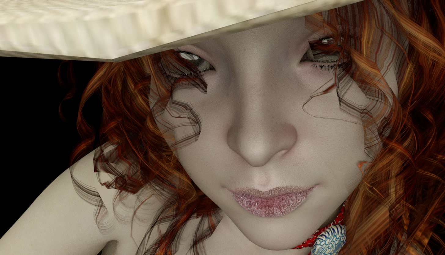


red.png
1456 x 837 - 2M

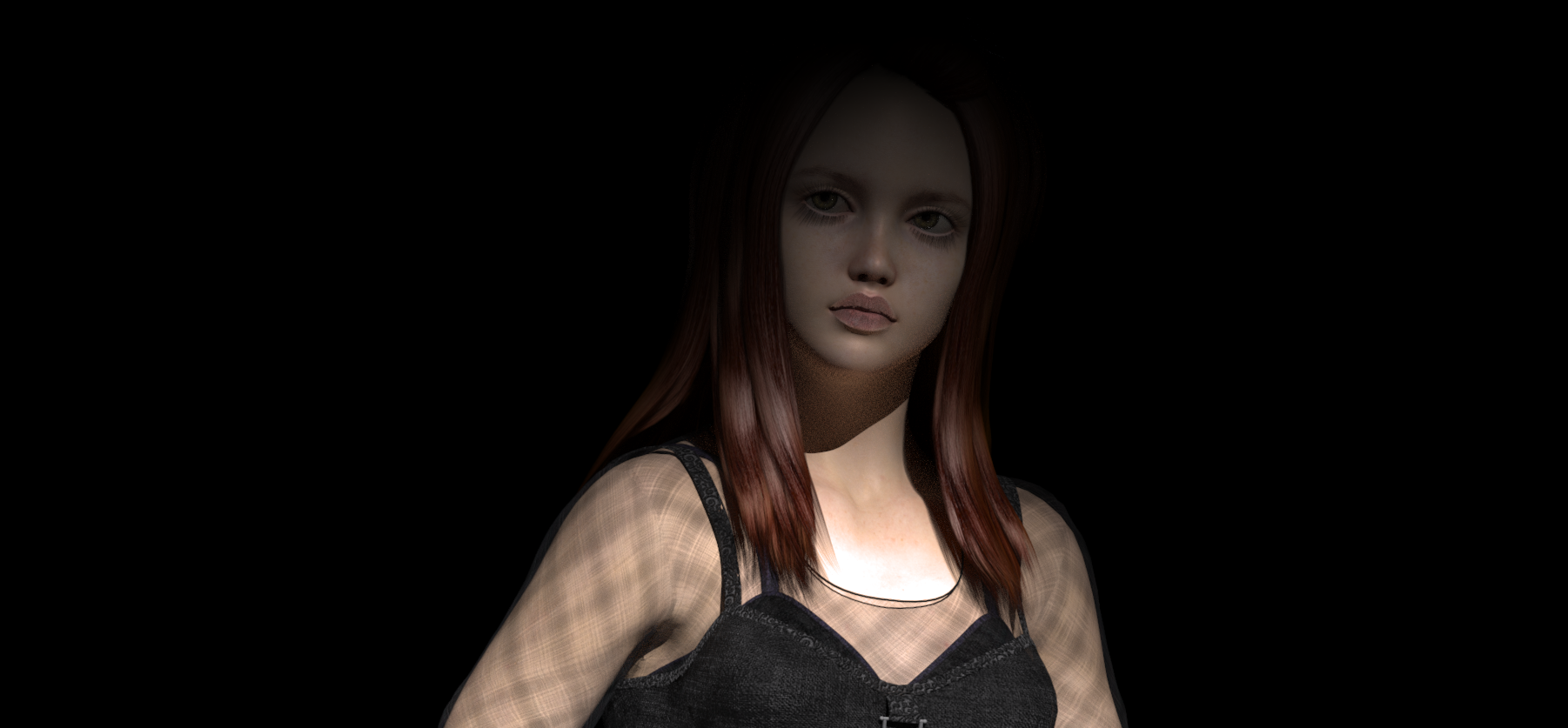
in the shadows.png
1802 x 837 - 552K
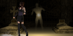

not alone.png
1802 x 837 - 2M
Post edited by saywhonow on


Comments
Well my first reaction is, the first render: she has too much hair in her eyes literly, second render: She has too much light on her chest and not enough on her face, third render: her feet are cut off and is the image in the background supposed to be a ghost if so it has too much noise and too visible. But these are just my opinion maybe someone with more experince can tell you more tech stuff you can do to improve your renders, but you are off to a good start
Thanks Saphirewild your right about the third render it is supposed to be a ghost but it's just not right I need to have a go at again I think, the second one though her Face being in the shadows is kind of what I was going for but I see your point that there is too much light on her chest
I don't use Reality so can't assist much. I really like the camera angle on the first one, I'd suggest watching unintentional groupings of things which may be in front of each other, like the hair and eye. It almost seems like one thing, like the pupil/ iris is stretched to the left, when it's really the hair strand. The second one, love the look on her face because it's open to interpretation. Agree with the chest lighting, if Reality has anything similar to the Iray setting of "burn highlights" that needs to be turned down so the highlights are spread out. And for the third- I rather like the grainy ghost, as long as it isn't supposed to BE a ghost- kinda cool effect actually! More like the Sandman or when things first start beaming in like Star Trek lol. His feet disappearing is really cool!
In the third one, not only do the feet need more room (not cut off) but watch your head too. You're not leaving enough space above it IMO. I love the pensive look on her face, well done!
thanks for the comments Novica some good advice
a new rendered western scene i,ve called draw
I really like the angled point of view on "the draw"
thanks ice dragon art
a new one today "Clockwork"
Clockwork looks amazing Say!!! She looks like someone you would not mess with!!!
Thanks Saphirewild
Youe quite welcome Say!!
lawman
Really like this render Say!!!
thanks saphire
two today
mirrored
no angel
a new one for today
Outlaw
raven
happy hour
Wow is all I can say about the amazing rendering here Say!!
Nice atmosphere
Thanks guys
The outlaw is totally wicked looking, that smile just gives a very sinister creepy feel to it.
And I love the atmosphere of the last one.
Thanks Ice dragon
orchid
https://www.daz3d.com/gallery/images/369006/
So simple but yet says so many things to me!!!
a portrait of a Character i built from genesis 3
https://www.daz3d.com/gallery/#galleries/107778/
Hmmm she looks like she may some mischief in mind! Very nice!
Thanks ice dragon , I was going to call the portrait "mischief" so I'm glad that came over