Futuristic Glass Elevator and Building Kit - in the store! :) [Commercial]
 Chanteur-de-Vent
Posts: 567
Hi all,
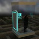
I've been trying to create a 3D model for some time now, but I just can't get it right. I'm really stuck, I don't even know what to change in theory, leave alone in the much limited practice.
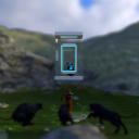
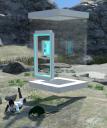
So, basically the idea is a Sci-fi elevator, a device that is made to inspect unknown planets from a safe distance, behind the bulletproof glass. Basically you take the elevator as some kind of shuttle to go from your ship down to the planet surface to look at the planet. Or to go down, once you think it's safe, and explore the planet.
I attached some pictures off what I already have. What I would like is the following feedback:
1. Does this come even close to any quality work which you might (ever, with a perfect budget) consider to buy? Basically if you think it's garbage you could have assembled yourself in a couple of hours, just say so. I won't get offended. I have no idea what this level is, and I'm jumping between infiriority complex and grandness mania. (As in I'm very proud I did this small thing, but I suspect it's so much less than anything worth making.) Also, if you would consider downloading it as a freebie, that's information as well.
2. If this could get to some level, what changes would you suggest to add to this model to make it look proper and nice? Like what details would make it better? Textures, extra functions, extra parts. You name it.
3. Are the attached pictures of decent quality? Or would you say I could improve on that as well? If the last: what do you think I should improve?
Thank you so much for your help!
EDIT: Beta testers needed! Please read till the end of the thread to see the pictures of the finished product.
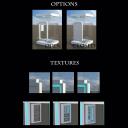
Ok, guys, the set is as good as finished. Since most of the stuff I changed from the previously posted pictures is minor, I'm calling it done and am calling for beta testers. The full fleshed promo's will be done after the beta test is finished, in case I missed some major problem and need to change things.
So, I'm looking for about 8-10 beta testers.
1. About 5 normal DAZStudio Iray users
2. 1-2 Users of Reality and/or Lux
3. 1-2 Users of Poser to see how the .obj import into the program and render in Poser
For the moment the set is Iray only. If you're using more than one engine - bonus points for you, means you can qualify for two spots on the list.
Rules:
1.Don't share this product anywhere with anyone, especially not online (speaks for itself ;))
2.Don't share your renders with it publically until I've submitted it to the DAZ shop and at least got a positive response. I would like to keep it contained
3.You are more than welcome to make artistic renders with it and send it to me through private messages
4.You get the product for free, so no "delete after beta test" small print. If the product gets accepted to DAZ I'll try to make sure it will appear in your Product library as a gift.
5.I reserve the right to deny to beta test requests (in case the spots are full or I have enough testers for your render engine of choice)
If you're interested send me a PM with the mention of your engine choice either through forums or on DeviantArt (link in the sig).
Current state:
Iray slots: full
Lux/Reality slots: full
Poser slots: 1 free
EDIT #2: The product is in the store now! See here: https://www.daz3d.com/futuristic-glass-elevator-and-building-kit







Comments
I like this! I think its an awesome idea and can think of all kind of trouble to get into with something like this. I can't answer as far as quality goes as I am still pretty new and don't do any modelling at all. Try a couple of renders where the outside is not so out of focus, its hard to tell just how well you can see through the glass when the background is that blurry.
Thanks for your feedback, Ice Dragon.
Iv'e added one with no DOF and blur to the original post. The glass is pretty much transparent, save from some reflection effects.
Oh that's much better. I can still tell there is glass there easily as well. The other pictures are cool but the one you just posted shows exactly what the glass looks like. this will be very cool once you figure out exactly what to do with it. I'm sure others will pitch in as well.
Made a new texture, I think now it seems a bit more substantial. Not sure though.
Is it just me, or is this forum horribly quiet?
I'll try to liven it up. This is cool! That's about all I've got to say, I think it is already store-worthy.
It's a fun idea and I like what you've done! Personally, I like different material sections, so having an area of trim around the door was noted.
What comes to mind when I look at this is that the edges are too sharp. It's easy to do this in modeling programs until you try to look at it in an render. You need to bevel the edges in strategic places in order to give light something to work with when it comes to rendering. Even in modeling hard edged models, you have to add bevels to the edges or else it just won't look right when the light hits it. Detail wise, why is the lip of the door so high if this is an elevator? The lip of the door is higher than the knee knockers on a ship(That's 6 years at sea talkin', land lubber!) For an elevator --it doesn't make any sense. The final thing I'm going to mention is that your model is short on visual detail.
By visual detail, what I mean is that there's nothing really for the eye to play around with when you look at it. Even though this is a clear elevator, it's missing design elements that make it interesting to look at. Try adding some wire conduit to the contro panel. Do something on the doors as well to give it not so much flat space to look at. The bevel tool is your friend --use it. Add grooves and ridges and other points of interest. You're going to want to do some real texturing afterwards in order to bring out other details that you can't necessarily model with geometry like scratches and dirt and stuff. It's too clean and too flat to really sell the idea that you're trying to convey. Take a look at Stonemason's scifi stuff in the store. It will give you a good idea of what I'm talking about. You want your model to be interesting and detailed --so you're going to have to add some geometry to accomplish that.
Thank you, wwes, Novica and will2power for your feedback.
Novica, the trim edge around the door is actually texture work, the door has one material section. But I'll have a look if I can change it.
will2power, thank you so much for your comment. I thought that something was obviously eye-soaring there, I think you're totally right with the sharp edges that should be softened. Sci-fi usually has those smooth edges everywhere, so it's even extra unappealing to see hard corners here. And yes, details should probably added as well. It's indeed very sterile.
As to the high step: it's my mistake. I created the model without thinking about scale, just placing the door in the middle. When I later scaled it up to fit a human inside, the step became too high. I should shift the door downwards.
Again, thank you very much for your feedback. It's really helpful.
Basically started over with modelling, here are the new shots. I tried to smooth out the corners and added some details, the elevator now has a lantern for overnight flying.
This is barely textured, just a geometry preview. I'm looking for feedback on what to add geometrically before I get to texturing this guy. Anyone suggestions?
Also, how do you like it as compared to the first attempt (see original post)? Better, same or worse?
Much better... very Apple.... It needed to look like there was stuff making it go and or do what it does... Previously, it was a little too spartan... It reminded me of those really simple 60s TV Sci Fi props... Which while it isn't such a bad thing, this way it might be usable to a greater audience... If it's a product... If it's just for your own use, than it should be what you envision. Also... The lights around the base in the previous version were a nice touch, a little "Dr Who"... In a good way.
Does it only go up and down? It looks like it might operate within multiple dimensions... N-Dimensional Motavator? Defile the laws of Euclidian space with the touch of a button... Infinity 4D presents... The N-Axial Transvayor... No?... I need rum or something... That might help. Probably not, then I'll be saying stuff like Eclidivator, or 4D-Discombobuvator... That first one just sounds dirty... Especially if you say it fast. But anyway, it's an awesome idea for fun adventures, especially if it's going in more directions that up and down... Or left and right... I'll fess up, I just had some tequila a little while ago, so ignore any of this that you don't agree with.
But I do like it much more now.
Addressing your questions (which I just noticed now)...
1- This is a hard question to answer... Mainly because I just dropped my iPad like six times and my wife is looking for me to start barbecuing some stuff and I'm just writing this while hiding out in the basement... But anyway... I hardly ever buy stuff except for figures and clothes... I try to make my own stuff and whatever I can't, I just become frustrated about and obsess over until I forget why I wanted to make it in the first place. If this is more or less your first real completed model, then it's a great job... Realistically, I've seen really dumb ideas and super simple models selling for like $10-$12 and thought... Damn it... I dropped my iPad again.... I thought something... I forget what now, but it wasn't complimentary... This is many times better, you are interested in improving your craft, you are interested in feedback and you have a neat idea... Damn tequila... It's making it hard to use word stuff... Barbecuing should be a hoot now... Anyway... Detail-wise, this reminds me of some of the old DAZ freebies, which would eventually become unfree and sell for like $7 or so... Okay, I think I answered the hell out of number 1...
2- Cupholders! No just kidding... Maybe some details on the bottom, in case someone is looking up as it falls on them... Stuff falls on me a lot, so this detail is important to me... Maybe make the floor area a separate material zone so if someone wants they can change its color or texture... Interior ceiling light... No chandeliers... They hurt when you jump up into them. I like the idea of it being able to operate anywhere, but perhaps some sort of glass elevator tube... It violates what this is about, but if someone needs a snazzy add-on elevator, they might pick this up... I liked the lights you had on the bottom before, but it could be the tequila... The flashing red lights on my pressure casting machine look sooo cool now... Oooh... That's probably not good... Eh, anyway... Maybe you could have some optional exterior entry device/scanner/screen... I'd imagine it knows who you are and it opens only for you, but someone might have a render where they need to have some fiddling with something to get inside before something eats them... That happens to me a lot, so that is a detail that floated into my head... Oh, yeah... Try and make a tiny gap or "cheat mark" around the actual door... I can't tell with this, but some models I've seen, the door looks too fake without something to make the edge pop... Spellcheck kept insisting on "poop"... Stupid spellcheck... Or maybe I write poop a lot... In that case, stupid me... Okay... I've butchered the hell out of 2...
3- The images you have there are pretty good... Especially the last set... I don't know what level DAZ or Rendo require, since my crap is only on ShareCG, but it's better than my renders...
Well, I should go now... This is probably more to read than anyone wants, and it's not even really funny... That and my hiding place has been discovered and people are coming over soon... Hopefully just guests and not the people with uniforms and nets.
Anyway... Good luck.
I love the second edition as well. I like the first one pretty well too. I can think of a ton of things this would be useful for. You can tell you put a lot of thought into the remake. I think it is a bit more functional in the second. off hand I can't think of anything to add to it that won't destroy the lovely glass look of it. I love the symbol over the door that was a nice touch. Cant wait to see textured.
Yeah, I didn't take note of that... Texturing... Then again no surprise as I'm wearing my shoes backwards right now... But, despite that, I'd like to point out, however you texture it, make at least one version that retains the glossy, Appleish, glossy glass look that you have going in your renders... It's simple but it really works on a certain level... Or ignore any and all of this as I'm pretty tipsy at the moment... Your call.
First, I like this second version much better. It looks more sleek and Sci Fi-ish <-- my own term! I could actually see using it in a render now where I'm might not have had a use for the first one.
McGyver was WRONG! It was funny as h**l! And, in all that hilarity, were some really good points so bonus!
You do need to consider making multiple material zones so those of us who like playing with shaders can get really wild with the personalization. Taking a quick count of surfaces that could be modified, I'd say at least 10 material zones, but then that's me. I could actually do as many as 20 on that model and be happy. Most vendors don't put that many in their products. A texture on the bottom is a must have a I can totally see doing a render where someone might be looking up at the 'elevator'. Is there an actual door that closes in the new version because, yes, McGyver had a point there, too. Make it look like there is a small gap, but not much of one. We don't want stray atmosphere getting in. Speaking of McGyver's flashing lights on his pressure casting machine, I don't see any type of controller for the elevator, either, and I'm wondering how one controls where the elevator goes and/or opens the door when you get there. Given the almost totally glass nature of the elevator, something handheld would probably fit as I don't know what you could for a fixed one that would actually look like it belonged.
For interior lighting, I would make sure, if it doesn't have a specific light, not chandelier, that you make the interior part of the elevator top it's own material zone so that, those of us in Iray, use it for some emissive lighting. Not too sure how those in 3Delight would do that. Overall, I really like what you've done with it. I wasn't too sure when I saw the first one when you first posted, but now, yeah, I'd buy it if I saw it in the store.
Thank you McGyver (Knittingmommy was right, it is damn funny), Ice Dragon and Knittingmommy for your feedback.
Here's a summary of remarks, as far as I can read between the droppings of the IPads and tequila. I really hope McGyver's IPad didn't break somewhere during the typing of the answer.
1. Some sort of key panel should be added to the outside, so one can lock up the elevator with noone inside and come back and open it.
2. A ceiling light should be added, either by an extra geometry or allowing for ceiling material zone. I'm thinking of adding an emission uniform round lamp geometry (you know those semi-round on bottom side and flat on the top side.)
3. A separate zone for the bottom of the elevator is very desired.
4. A door (for closing the elevator) should be added, and one should try to keep a very tiny, but still visible gap in between the door and the door frame. Just to indicate the door is a separate part. (I was planning the door anyway, it was there in the original elevator, just didn't find time to make it yet.)
5. For texturing: apparently the fancy blue round lights from the original model were very loved and should come back. But I should also keep a texture that's just fancy apple white, without fancy blue lights as an option.
6. A glass elevator tube as an option, to increase the multifunctionality of the elevator.
But, but, there is a control panel inside the elevator!
You see that square box inside, on the wall? It's supposed to be a touch-screen controller for the movements of the elevator and opening of the door from the inside. It should be textured, yes, but it's there for that sole purpose. Did you just miss it, or do you think it should be removed because it doesn't belong?
I'm off to implement some of this, but I'll be back with another geometry preview before texturing, so if you guys have some new idea's, just post them. I still have time to implement them.
Yes, I just missed it! I had to go back and look. Somehow, with it not being textured, it kind of just blended in and I have to admit my eyes aren't what they used to be. Awesome! Looking forward to seeing the next previews!
I quite liked the way this one was looking originally but with the new pictures... WOW, it's looking all kinds of awesome right now! Loving the progress and following your work on this :)
Somehow i just found this now! I am very impressed by your endeavor into making things, so I'd say you are on a good track. There is a lot of improvement from the first to the second version.
Things that came to my mind you might consider for the nest step: I would like the glass to have a more solid feeling to it, probably a higher opacity and /or a stronger refraction. I guess it would be fitting if that kind of future elevator has one of those holographic user panels. Some kind of fancy chair as travels could take some time so you need to rest?
And as my brain tends to have weird ideas you could add a pole in the middle as an alternative so you have a future pole dancer "peep box"... ok now I'ma gonna hide somewhere...
I had an idea for a dried shredded squid based breakfast cereal, but apparently nobody in this house is willing to try it... Admittedly, it tastes best when served in saki instead of milk, but that's not an idea for this thread... Maybe over at the breakfast and snack food forum... But anyway, keep the interior wall mounted control pad, I goes well with the elevator lineage and gives people something to interact with when in the process of adventuring... Two options for its expanded use could be 1- To allow it be hideable so if it's not needed or wanted you can poke the little eyeball icon and make it invisible... And 2- maybe make the face plate/display removable so someone can tinker (not tinkle) inside to save the day when it malfunctions or things go awry... In terms of details the insides could be a simple as some Filter Forge techno-circuit textures with displacement or just small greeble-like raised details. If you are not familiar with FF, you can go to their filter library and check out the texture filters category "Techno"... If find those useful, you can download the trial version and render out whatever you need/want... Or conversely there may be something similar in Genetica Veiwer's texture library... Genetica Veiwer is a simpler free version of Spiral Graphics "Genetica" texture generator.
What he said... I think.
Ok, here's the easy small stuff so far:
1. Keypad for opening the door from outside
2. Ceiling lights (geometry, and views with and without it at pitch dark night)
Left on the list together with new suggestions (I'm sorry Linwelly, I'll have to pass on the stripping pole) for geometry
1. Glass tube for the elevator
2. Chairs - I thought of it multiple times, thanks for reminding me, those are useful for such a shuttle
3. Some techno-geometry inside the control panel if you open it - if I can pull it off. Sounds like a challenge.
There will be another preview coming. This I posted because otherwise there will be too much pictures to show once I'm finished with everything.
Feedback and new geometry idea's are still welcome.
Wow the lighting is fabuous!
The renders look awesome! I'd scale down the keypad, on average they are not much bigger than a human hand... Most are about the size of a smart phone or less. You might want to make the keys an option and go for a touch display... It gives you the flexibility of different displays and alien characters. But it's fine... The way it looks now (red keys, glowing characters) has a nice retro look.
Yesterday I got bored and rendered out a bunch of "Techno Circuits" in Filter Forge, then I got even more bored and made a new filter, it's not up at Filter Forge yet, it could be 24 hours or more, so if you'd like, here is one variant... 800x800 and seamless....
Over at the "An OT thread for images" or what ever I called it, here at the Art Studio forum, you can find the Bump, Normal, AO and Emissive maps in my last post there... They may need tweaking and FF does not do emissive maps, so I did that in Photoshop... I didn't test any of them, I just let FF do its stuff. If you want larger versions, the original are 2400x2400, I could send you them. Also, anyone reading this is welcome to them too...
You could use this sort of texture, unless you have something else in mind, for the circuitry inside the display housing.
Also, sorry if I'm making too many suggestions.
Ok, here's my first tries making an "inside wiring" geometry and a back texture. I'm sorry, McGyver, I've tried your texture, but it's just a bit too detailed for my purposes. I needed something that would agree with the geometrical elements.
The idea is a battery, a cpu, a couple of transistor and capacitors. I probably will retexture the capacitors (the cilinder red ones), but the back-texture of the motherboard I want to keep.
What do you guys think?
I think it looks kind of cool! I like the long shot, but the closeup isn't bad either. I think it's coming along nicely!
Thanks, Knittingmommy.
I've played with textures a bit and added some minor geometry changes. The letters are geometrical and yes, they have their own material zone. I couldn't really think of a good fictional CPU brand. Suggestions are welcome. Feedback is even more welcome.
Oh, better and better. I like that the letters are they're own mat zone. Perfect for someone to do their own branding if needed!
This is coming along quite nicely I love it!
I keep meaning to comment but this looks really good.
Thanks, Knittingmommy, Ice Dragon and ZamuelNow.
Seems like I'm on a creating spread again. Behold, the door!
1. Without textures, shiny.
2. With texture enhanced gap, non-shiny

3.With texture enhance gap, shiny

4.With a textured sci-fi lock, non-shiny

The front basically looks like the back. The control panel is rendered open in this one, so it's still the insides showing.
Still to do:
1.Chairs
2.Glass elevator tube
3.Texture the control panel screen
4.Make a separate "control panel screen" prop to lay around when you show the insides
5.Texture the lower part with glowing blue circles, like in the first model
6.Give the keypad outside a "touchscreen" option with texture
7.Add an extra plane on the bottom to allow the bottom to be a separate material zone
Did I forget some wishes/idea's? Feedback and suggestions are still highly welcome!
This is just so incredibly cool. Can't wait to see it finished.