tip for "finding the loading item"
 patience55
Posts: 7,006
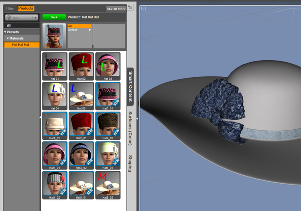
Trying to get a handle on all these delightful icons that appear in the Smart Content area ... gee, so many icons and only a handful "work" to load the item. Why is because most of them may be for 'materials' and the real item must be loaded first. Thing is they all appear together in the same basket so what to do? Well, I browsed to the real folders and added a letter to some of the icons so "next time" frustration levels can be lower.
Some of the icons [general speaking for any product] apparently may not work if there are .duf files present in the same folder as the .dsf files. One set being for 4.5 and the other for 4.0. Being on 4.0 I found deleting the .duf files - convincing D/S4.0 to refresh the pages - then it can load those new items. Of course I'm also stuck with a bunch of useless icons with "!"s which another day I'll figure out how to get rid of without bothering the CMS which is apparently rather touchy.
Thought I'd post of this labeling idea though in case it helps anybody else too. And maybe convinces a few content creators to be a little more inventive with their icons ;-) Thank you.
n.b. that the example I used was simply because it happened to be the one I was working on last night. It's a great product.


Comments
4.5 adds a label bar at the top of the icon saying what kind of item it is.
If you switch to Files instead of Products on the Smart Content tab it will only display items that are actually applicable to the item you have selected, i.e. it won't show material or pose presets unless there's an item selected that they apply to.
That's nice.
4.0
You can't select an item if you can't load it.
You can't load it until you find it. And even then a growing number of these files [in general] can't find something to load the item. Most annoying.
Interesting. Generally I don't use the smart content because I like to move content (except, geometry, textures, morph scripts) to where it suits my own workflow. Ok so it's a bit more work but at least I know where I put thing. Now where has my car keys disappeared to....
BTW I don't use the Hollywood style interface either. The Darkside style is best for maximizing screen space. But I wonder when we will get the feature to make our own custom interface as Daz promised some time ago. I was hoping something like in Matrix style (with brain jack too).
That's what I did in D/S3 and might go back to it. Trying to give this CM a chance though.
Just reset a couple of downloads and oh my!!!! Scary. Thought choice between mac and pc was bad enough ... now we've got dson and poser and legacy and trx and .... and ... in duplicate of course; mac and pc.