Adding to Cart…

Licensing Agreement | Terms of Service | Privacy Policy | EULA
© 2025 Daz Productions Inc. All Rights Reserved.You currently have no notifications.

Licensing Agreement | Terms of Service | Privacy Policy | EULA
© 2025 Daz Productions Inc. All Rights Reserved.
Comments
So, the clock is ticking and now with the last wedding, of this year, now behind me. I could start with the lighting.
Here a first draft of the lighting setup.
I had to revamp the emmissive shaders of the lightbulbs as well as the whole pommel of the sword. In this process I los the texture of the gem, but I think that the new shader preset is an improvement in comparison.
I also remodeled the room behind the scene and I had to cut the planned godray from the door. It just didn't worked out for the snake. She is too big. So instead I set another meshlight behind her.
getting there nicely
your hero needs a bit more lighting, it's too dark (you could try in a photo editor to use a gradient mask and light it up a little)
I really like your wall lights as it gives a nice authentic look and feel
keep it up
you could play with a zoom blur filter to give your character some speed and force like to imply a camera shake as he slides over this wing or whatever it is
also a slight camera tilt could improve the overall mood of the render
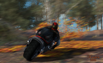
Autumn Run
I have found my first con to the new iray engine...no motion blur. I hope it will be a feature that's added in the near future. I use to use it every time there was any kind of motion in 3delight, so it is something I will be missing everytime I do an action render lol. Anyway this is the final render for this month. I did try to add a squirel as someone suggested, it just didn't work out so well with the blur effect.
~ Novbre
Hello. I've not heard that term before. I use depth of field on to bring him into focus more than his surroundings. I'll have to find a tutorial on that.
EDIT: I did not see anything on that. More information would be helpful, @Seegsons. Thanks
I think he is talking about a postwork technique. If I'm correct he talks about an additional layer that acts as a filterlayer/-mask and adds some motion blur, of a zoom in, artificially designed by the program you use. With "How to add motion blur" and "postwork" you should find plenty of tutorials on YouTube or other sites.
Thank you @HighElf.
I wasn't comfortable with an all over blur. I wanted some details to be sharp. Here is a compromise.I think I'll call this my final for this image.
Title: Over is more fun than Under...
Softwaer: DAZ Studio 4.10
@iilysArt - Think you did a good job with improvements. Nicely done. I wanted to use DOF on mine, but found it added too much to my render time. You did this well.
@Highelf - I think you've done well, too. I do agree with @seegsons that a bit more lighting on your hero would be nice. Another trick for Iray that I discovered, which you might make use of--if you want a glowing gem in Iray, duplicate the node of the gem -- for this, if your gem is part of the sword, you might have to replace it. Anim8or is a nice free program that you can download a simple community script to make gems from. You can then set it in place of the hidden gem of the pommel. Cutout opacity should allow you to hide your original gem. Now, put your replacement gem in place, apply whatever gem/jewel/crystal shader you like, then duplicate the node gem--or if you prefer just use the original, it might still work. Scale the copy version down so it sits just inside the original, apply emmissive shader to the inner gem. Bam--glowing crystal with both shaders intact. Tinkering with shaders of both may be necessary to achieve effect you desire ultimately.
@Novbre - I have never been able to figure out 3DL, so I never got used to it, but it is a huge issue for Iray that it isn't possible--at least now. It's all post work of some type. Which, I think you've done a fine job. Between all of the lovely submissions, including yours, I really don't think I stand a chance--but that's okay since this is about growing and becoming the artist you want to be (and I feel I'm getting there at last). Well done.
I meant something like this (PM) but I don't have the original scene data, so I can't do it
render the hangar on a layer, the fighter jet on a layer, the guy on a layer and the dog on a layer
postwork in Photoshop
something like this
from the aesthetics you got the camera tilt in the wrong way - because the drama here is the guy sliding over the wing not being pulled off it by an unknown force
your camera tilt implies he's thrown off by a shockwave and pushed off-screen (you should then have a visible explosion)
but the guy is sliding into the action to do his thing, so you need to show that by changing the tilt the other direction
Hello, Thank you all for the ideas and constructive criticism. I'm a little flustered right now. I apologize. I have some other things going on and am having difficulty accomodating the multiple suggestion.
I'll revisit when life away from the computer isn't quite so stressful and I can settle in for the fun this is supposed to be.
Again, your comments are appreciated.
Please withdraw this image from the challenge.
done
it was only meant to visually explain what I mean
I do apologize
cheers
@Seegsons, you have nothing to apologize for in the least. Your thoughts and guidance are appreciated and I look forward to exploring them in a couple of weeks. Truly, it is valuable information and that you cared enough to share it warms my soul.
Thank you.
So I started to refine the lighting. I swing between two different techniques.
I show here the one, i finished just now.
I lighten the babarian up (I agree with you here that he came up way too dark), as well as the snake. And in the same moment I darkened some of the shadows in the corners.
@wanderer: I will give Anim8tor a try, in another project, but it looks promising. Thank you for the tip.
@HighElf - I think this one looks better, definitely. Glad you found it of potential use. It's lacking in several ways, but if you download the free community scripts and just want to do simple stuff, it's actually quite helpful. Easy to build simple props with it. And that's coming from someone who finds Hexagon and Blender confusing.
Wow, all the submissions have improved alot. I got kidnapped by a little old lady that needed her roof replaced so I missed out on most of the fun this month but I am going to try to get my entry cleaned up for a possible 75-80th place finish! Fingers crossed.
Wanderer~The Zombie battle changed a bunch, where did the giant hand go? Well it looks great anyways, the action, lighting really cool. I do think you should have either another Zombie peeking through the shot out window or maybe some giant fingers wrapping around the wall through the window maybe?? ;) Just sayin.
The motorbike looks nice and the fairie battle is lookin epic. Well back to tending to my wounds, damn raccoon tried to throw me off the roof.
Glad the raccoon wasn't successful atacit_23cd33397. There are a couple of days left. Hopefully you can finish by then.
@atacit_23cd33397 - Thanks. I appreciate that. I'm also glad the raccoon failed. Hang in there.
Here's my novice effort to create a compelling character that I'm thinking of including in my RPG Don't Look Back. Any suggestions for better lighting on her face? I want to keep the "air" of darkness and shadows but I'd like parts of her face like the eye and mouth to be more visible.
Enjoy
Chuck
I would either use a fill light for her face and/or use some dodge and burn tools for her eyes and maybe her mouth.
The shadows in particular are too hard for her imo. Even for her old school Brujah look. Also a little bit of shadowplay on the wall could help, maybe you show us your lighting setup, and we could try to figure smth out.
As it's the last day of the month I am reposting my final entry
he looks a bit like David Bowie
The lighting is inspired by the color palletes of Frazettas works and the original Conan book covers.
I think I need a bigger sword for this one
Software used: DAZ Studio 4.10, Krita
I wish I had been able to be more active in this forum this month, unfortunately it took the rest of the month for me to get a second draft finished on my arcade image. This will have to be my Final submission as time is running out.
For what it's worth here it is, thanks to @Wanderer for some constructive criticism. I wasn't able to address everything but I think the image is better for his comments.
@Night678winG - So glad my feedback was useful. Glad you were able to make it before the deadline. I think the improvements are really good, and you were very creative in your solutions. Well done. I was trying to return the favor for all of the wonderful input you gave me on my image.
So, this is a simple re-post of my final official entry to make sure that everyone knows this is it and to give credit where credit is due:
It's Not Over
Daz Studio with some post work Paint Shop Pro and Photoshop
First, a lot of people gave me great feedback that helped make this image what it is. I feel that @Night678winG gave me especially good advice. I'm thankful to the rest of you who pushed me to be my best--you know who you are. Also, the cord and pull-cord for the hanging lamp were made from a freebie rope prop that I want to make sure gets credited--from BionicRooster at ShareCG here. I did credit this earlier in the thread, but those things are easy to miss. I ultimately chose to leave DOF off for two reasons--first, the render was a beast even without it, and second, I was inspired by the work of Frazetta and comic illustrations, especially of the 70's and 80's. No DOF there. I struggled on her pose a great deal, and in the end attempted to go with a strong two-armed stance with arms almost locked, but for the slight recoil visible at this moment of the scene. Thanks to @Night678winG for the wonderful comic art examples that helped point me in the right direction. Also, a huge thank you to @seegsons for his helpful insights, and tips for things like LUTs which I hadn't even heard of before.
Best wishes for success to all. There were some really wonderful visions shared this month and it's really going to be hard for them to choose who to showcase. Hope everyone turning anything else in makes it before the deadline.
it's always fascinating for me to see cool looking 3D character creations - something I never touch
The Challenge is now CLOSED.
Thank you for participating.
May 2018
Showcased Participants for the May Action and Props Challenge
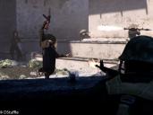
Watch Out!
For this Showcase we looked at the artist who we felt demonstrated using action and props to create a sense of danger or urgency.
For those reasons we have selected dstuffle to showcase


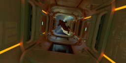
This is Us
For this Showcase we took a look at who we felt demonstrated the use of props and action to show a day in someone's everyday life.
The New User we felt best showed that this month was seegsons
Velocity


For this Showcase we took a look at who we felt created an image that made you feel like you were part of the action or movement of the scene..
The New User we felt best showcased those things this month was Novbre
New User - Welcome
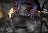
Tangled up with Ink
Congratulation to all the winner