Daz 3D is part of 
Connect
DAZ Productions, Inc.
7533 S Center View Ct #4664
West Jordan, UT 84084
Licensing Agreement | Terms of Service | Privacy Policy | EULA
© 2025 Daz Productions Inc. All Rights Reserved.
Comments
This is definitely some great artwork for this contest, but I included in this post this picture because it seems to have some strange color saturation on the lower right side of the girl which seems to have appeared only in postwork.
That is the lower part of her skirt. It also appears before post.
Hmm, pretty sure the postwork (on the right) looks a bit strange (color is oversaturated) on my monitor. Perhaps a third party could give a second opinion. :)
Hmm strange I checked all the values in photoshop and this is saturated yes but not over saturated. Actuallly according to my histogram that spot you pointed to is no where close to being oversaturated. So I think you need to calibrate your screen. Also this is a translucent peice of fabric with light shining through it from behind. this is accurate as is.
Okay,
First, for all the CV artists bold enough to put themselves "out there" for this month's challenge--congrats.
My favorite is Leana. Now, first and foremost, I like the render and butterflies and the bokeh, but in keeping with the challenge rules, the constructive criticism I would offer is as follows.
I think the color pallet is awesome. I think the pose is both open yet closed, and this is a detail of subtle complexity that I like very much and think works very well in this render. What I mean by this is that in a recent Ted Talk, the speaker described spacial footprints and how uncertain subserviant people often display smaller footprints. They sit tightly. They stand tightly. They fold their arms, etc. Conversely, dominant, free-feeling people spread their bodies out into large-body footprints. The example in the Ted Talk was something along the lines of someone going on a vacation and lying on a King-size bed and just sprawling out. Legs and arms splayed as if physically screaming I'm FREE!
Ths woman's emotions are mixed. Her narrowly poised shoulders are hooked between her outwardly spread yet crossed legs. In keeping with the Ted Talk interpretation of body language, she feels both carefree yet cautious. The butterflies--whimsy, youth, innocence. Perhaps they represent freedom. They definitely represnet beauty.
The thing is the butterflies are all around her--fluttering. It's chaos. This is almost like a still shot that also somehow succesffully captures a series of frames because one's eye does not simply capture it all at once. Instead, my eye captures the scene in still frames: the expression and pastel blues, yellows, and grays. The next still shot is the butterflies at large, around her--then that central necklace. Finally, for me, anyway, the final still shot that stands out as my eyes take in this render is the butterfly on her right knee. This single butterfly completes the story and connects her to universe at large. This person is on the verge of opening up to someone--yet, she's cautious. Her legs are crossed. Her arms are narrowly positioned. For her, it's a moment of hopeful vulnerability.
Excellent Job.
Okay--now for the difficult job of saying what I would do differently. Since I am not going to attempt to compete with the complexity and simplicity of that butterfly cloud, what I have done different in my render is turn one render into a triptych. I have attempted to capture the arc or still shots that my eye saw in Leana and freeze them in three distinct moments of my triptych. These frames move left to right.
Frame 1: Outright, uncontrollable joy that would ultimately lead to such "hopefulness" as described above in the original challenge image. Instead of the butterflies connecting with the viewer or universe, I have chosen eye contact and expression.
Frame 2: with the fading of initial exuberhance, she becomes protective. There is a drawing in of the body and of the body footprint. The joy is still there in both the body and expression, but everything is becoming more protective. The eye contact remains.
Frame 3: Hopeful vulnerability. She is giving into the emotion, yet she remains protective. She exhibits a small footprint similar to that of Leana, and in the same way the butterflies connect Leana to the outer world, Ella's eye contact connects her to the viewer, signifying openness, something welcome. Hope.
Note: in each part of the triptych, I am attempting to maintain the image of the butterflies in the abstract by keeping the bokeh.
In terms of lighting and texture, this challenge render reflects a lot of pastels: lavenders blue, yellow, green. Basically, the Leana challenge render is Easter--hope eternal. Even the sharp blues that contrast the pastels signify innocence. Very nicely done. Very artistic and metaphorical.
So.... to achieve some sort of contrast, I guess I'm going to attempt something more photorealistic and trust in eye contact to convey eternal hope.
At any rate, this was a great challenge. As this late entry shows, I had some difficulty with this and could not submit my render until the last few days of the challenge.
Nice renders. Nice challenge. I hope people like my interpretation of Leana.
Some thoughts about this, you both have a point.
@Ruris This is a valid point, what do I want to achieve and accordingly how will I use the tools at hand. Too often I tend to think in terms of photography and apply the standarts used there but there is really nothing stopping one from playing around with the settings and see if soemthing else is giving me a result that fits better to my idea.
@daedalus7 Doing things in postwork or not is someting everyone has to find themselves. I do like to use the DOF and I like it a lot and I think the transitione from out of focus to in focus is something that is rather difficult to immitate with postwork. Working in layers sure is an option but needs a skilled user as well to not have the one thing of the front layer stick out too much (It's a bit a pet peeve I have and I have pointed out renders here where it was done that way ). The again its as well the question of how skilled someon is with postwork at all. when I started out with DS I had very little knowledge about post and thus avoided it at best, finding solutions for what I wanted withing DS. Knowing how to do ting in post on the other hadn is giving you more freedom again, and in some cases its done faster in post, but I wouldn't ultimately say that doing most in post is better or the other way round.
I think bringing up the point that doing things in DS you can do more and different than to just try to copy photography is a good point, but looking at how they do this or that can still help in understanding a topic.
I would think that Shudu has been given a very soft light from the front and the golden yellow tinted one from both sides, and if you look closely you can find that the lighst are being refleced on her skin and that way make the details visible, so glossiness still plays an important role in this image, and I suppose one can do the same for a real photo. The Lights in the photo reference is a bit blown out so it is dependant on the stranth of the light, but I guess the level of glossiness (specularity) is about same in both images.
If you wand a really absorbing black see here what happens :D https://mymodernmet.com/vantablack-worlds-blackest-black/
This one by @Linwelly gave me a last minute idea.
Only thing that I can think of pointing out is that the color of her eyebrows make me think that her eyes are glowing.
Yes the eyes are emissive :D
Moody twist you've got there, I would suggest to lighten it up a bit more (I know you have that tendenca to very dark scenes ) . The glowing yellow point on his lips is a bit irritating, I guess it's something he smokes, but straight up front we can't identify that, so maybe you can give that a twist down so we can see more of what it is.
I'm not sure about his pose, it's neither s relaxed "ok, I just wait for you here" nor an active agressive stance, so adjusting in the direction you want that might give this a clearer message.
Well, my screen just died and I had to replace it. I guess there was something strange going on after all. :)
Sorry to hear, breaking down material is always a headake
I really like the dark moody feeling you have going on there but if I might suggest turning his head/neck slightly so you can see the cigar in his mouth instead of just the lit tip? Also the noise on the image can be cut down dramatically via the Post DeNoiser in the Filters section of the render settings!
Elli
Was still awake when I read @Linwelly's comment so I went back in to adjust the exposure value, make a change to his pose, and adjust the brightness of his cigar. Afterwards I let it render for a total time of 6 hours 14.80 seconds while I tried to sleep so as to be rested for work today. Don't know if I'll have time to make any other changes after I get home this next two days, we'll see.
@Elliandra, Thanks for your comment. I was glad to read that you liked what I had posted, and though this new version was finished rendering and just needing to be saved (I hadn't woke up just yet , today's my short day at work.) I remembered your mentioning of the Post DeNoiser in an earlier post, and made use of it in this version.
P.S. Is it just me, or did I channel "The Wolverine" as a shadowrunner?
You totally did!!
LOL yes you did :D
Nice changes you did there. Tip for the future when you wish to go for a dark image again, Iray render times are depending on the amount of "real" light you have in your scene, so the darker it is, the longer it takes. Maybe next time try to give your scene a lot more real light that you really want to have (be that sun/environemnt HDRI, or for emissive surfaces, spot light or the like, crank the value up). You can then either darken it in postwork or you increase the f/stop value in the one mapping tab.
The way you did this time with adjusting the exposer value you're resulting image is brighter but the Iray renderer still has to work with the low absolute amount light und that way needs a freaking long time to render. Hope this helps you speeding up render times :D
@linwelly: Hmm, this is more my own understanding of light, your statement could be right as well. Its not the lumen or intensity of a light object that makes the scene easier to render, but more towards the total surface area of the light source hitting the scenes. A single tight spotlight through a window trying to light a room would be relatively difficult vs a geometry spotlight 1x1meter thats within the room itself.
Back from a very, very damp Scotland and playing catchup...
First inspiration was Leana's image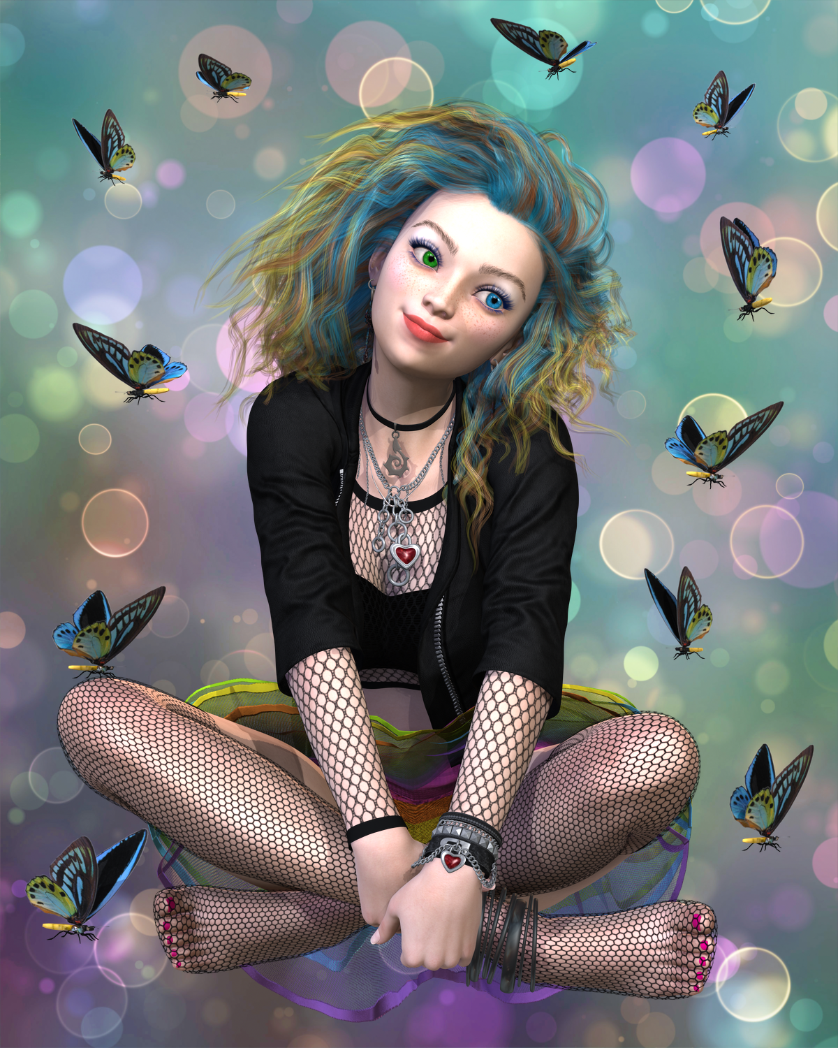
And my response to it with Medusa:
Then Linwelly's image:
Ended up with the final of this. The arm is off, but I didn't (don't) have time to re-render her. Title: Not what she was expecting...
Thanks, well at least I finally found some good use for my 46 inches tv in the living room....now I can see ALL the details on screen...
As a side note, I wanted to do a render using the same armor and hair as you did in the image, but got sidetracked into converting those to dForce, which I mostly managed, but very time consuming for a first time thing.
So, I will make few if any comments regarding the reference images as I looked at them as inspiration for my take on the particular image. Since this is a free render, I tried to weave the five together into a single story.
First - Elliandra
From the reference scene, my reference point was the expression on the girl. As I noted, maybe she could have lost a piece of jewelry, so I used her expression as an idea for my image and made Cora's wish bringing her a surprise.
Second - L'Adair and Linwelly
I used both of L'Adair and Linwelly's images and reinterpreted them as a mash up combined with my first scene. I don't know what Cora thinks she is doing reaching down, but no worries as Vicki and Gia are on the scene and looks like they will sort things out.
Okay, so there is no reference here, but I needed a story bridge here, so this is it (this story has about as many plot holes as a major Hollywood block buster, so just keep on suspending your belief). Looks like Anneka is having a conversation with Vicki, Gia and Cora. Let's see where this leads.
Third - Leana
Her reference gave me a bit of that meditation, relaxation vibe. So to continue the story, Anneka was only coming up for her normal morning meditation and talked the girls all into joining her.
Last - Kismet2012
So the girls decide to catch a bus, to where, we will see, but while at the bus stop, Cora decides to get a selfie with her new BFF's. But overall they don't give off that happy vibe. Turns out, as they turned the corner they saw the bus at the stop and started running to catch it. They were yelling at some surfer dude at the stop to hold the bus, but he had this brooding look on his face. Needless to say, he did not hold the bus, so they missed it and now have to wait for the next one.
THE TWIST
NOT AN ENTRY
Since the challenge included a twist, I wanted to have some fun with that and put my own spin on it with this storyboard that incorporates the scenes. It's called Cora's Adventure.
OK that was cute LOL I liked the angel's dialog on everything going on ROFL

This challenge is now closed.
Thanks to everyone for participating!
What a Departure – Given to the person who created an image that kept the feel of the original but was completely unique in its presentation.
The New User we felt best showed that this month was Kaye Kaye
Art in Motion - Given to the person who gave really helpful feedback to the original artist and then applied that feedback in a profound and interesting way to their own work.
The New User we felt best showed that this month was crosseyedchimp
What You See and What You Get - Given to the person who created a unique yet more faithful representation of the original artwork critiqued.
The New User we felt best showed that this month was AZDigitalArtist
New User Welcome
daedalus7
Congratulations on all featured artists, and a big thank you for the "New User Welcome". A big thanks also to Linwelly for providing my inspiring artwork and all the helpful info. It was a really interesting challange, and I was glad to participate.
Wow, thank you so much for your kind words, and congrats to all of the featured artists - your work was wonderful and inspiring. I still have SO far to go, but thank you for your encouragement, and to Elliandra for the inspiration!