Sci-Fi Starship Interior Volume 2 [Commercial]
 acharyapolina
Posts: 726
So here is the beginning of Sci-Fi Starship Interior Volume 2.
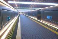
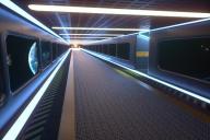
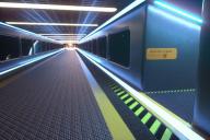
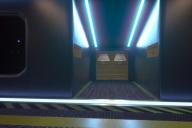
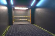
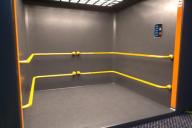
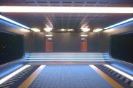
The first part is going to be the corridor. It has a corridor prop, and corridor with an elevator attachment prop. a corridor angel or bend, and a corridor end with steps and 2 doors.
So you can make the corridor as small or as long as you like. Also the corridor set comes with a material preset that make the wall panels disapear and turn into windows so you can see into outer space.
Here are some renders of the corridor, any comments or sugestions most welcome.

Corridor.jpg
720 x 480 - 173K

Corridor2.jpg
720 x 480 - 154K

Corridor3.jpg
720 x 480 - 162K

Corridor4.jpg
720 x 480 - 87K

Corridor5.jpg
720 x 480 - 102K

Corridor6.jpg
720 x 480 - 92K

Corridor7.jpg
720 x 480 - 151K
Post edited by Chohole on


Comments
The corridor looks great, but could you add an optional floor texture (shuttle bay wall texture for example) to the centre of the floor and increase the height of it? I ask, because it would be difficult to use the corridor with bigger aliens or robots for example.
Hmm good idea!
So as your sugestion I created 2 new floor presets for the set. that way the artist can chose what he she likes.
Hmmm, i think the second texture is too chaotic. A smooth texture (shuttle bay wall texture for example) would probably look better in the centre. The picture with the steps has the perfect room height in my opinion. Could you increase the general height of the corridor to this level?
So I have decided on 3 floors that I think will look good with the set. The first floor is a smooth one like you sugested. It looks great I think. Second and third ones are more like tile.
Also as you can see in the size picture, the whole corridor and the steps part are all the same size. Were you thinking I should reduce the size or make them taller?
The new floors are amazing. I thought that the height of the corridor is too low, but the height in the new pictures is perfect in my opinion.
Yea I like the height as well. I apologise for the miss leading pictures in the beginning, sometimes my camera angels are not that good. :D
Ok so here are the first images of the Sci-Fi Starship Quarters. The Quarters have a bed with animatable cover. A computer desk, a toilet and shower with animatable shower doors as well as the toilet seat slides into the wall to give access.
Also included are 4 different book objects that can be placed around the room, a cup object and a Sci-Fi sphere object. plus a Tank object as well as a wall picture that comes with three different picures.
Any comments, crits most welcome. :)
One of the generator.
Ooo, I like this. I definitely look forward to seeing the complete set. Nice touch on adding the books.
Side thought, I can totally see some character not liking the idea of sleeping so close to something that's nuclear powered, given the markings on the generator.
Great work. :-D
Out of curiousity, how easy would it be to mirror the placement of the window and desks so that you could alternate between room styles for differnt characters or to change up the room a bit? (Certainly not necessary, but I was wondering).
Good Point about sleeping next to Radioactive. I should probably change that. :D
About switching the room up. unfortunetly it is impossoble at this point as the bed and desk are part of the room.
Your first Starship set is amazing!
Would it be possible to hide the posters on the wall and replace them with optional screens?
Could you perhaps add another optional floor texture (first picture of the updated corridor floors) to the room?
Could you perhaps add a water tap to the sink?
Regarding the reactor: Removing the warning sign would be enough in my opinion. Could you perhaps remove the right pipe in the area, too?
Good ideas. I'll try them out. About the sink, I'm trying to make it more Sci-Fi but its hard with a sink because they all look the same.
Good point regarding the sink. Perhaps a small gap in the wall above the sink would be possible.
So here is an update. I liked wizard1200 ideas and so here is what I did. So first off the room will have 3 different floor textures you can chose from. Also the wall picture will have an optional computer screen material so you can chose between the pictures of computer wall screen.
The generator has 2 material presets to remove the pipes on top either the rigt or the left. I added a fauset to the sink and mad a hot and cold sensor nobs for the sink. and I changed the label on the generator to something better like Clean Energy.
The new pictures are looking great, but i would center the control panel and the grating below the text 'power plant control', because it looks currently a little strange in my opinion.
So I like you sugestion about the control panel being lined up, here it is. Next images will be of the Engine room, coming soon.
I love this, but will you be making a starship exterior to go with the interior?
Some of these sections are pretty distinctive, and would be visible from the exterior of the vessel.
The new control panel looks great and i am looking forward to your engine room.
Could you perhaps remove the text below the reactor? I ask, because the area looks currently a little cramped in my opinion and the text will probably not fit to all stories.
Speaking of the text ... Could you perhaps release an update of the Briefing Room? I ask, because the text on the door has a typo: Watch you're step > Watch your step
I'm looking forward to these. I have a sci-fi project starting soon these would be great for!
So I have submitted a texture update to fix the door texture, thank you for bring it to my attention. I had to update all of the door texures in the full set as they were all like that. so they should be updated in a few days.
I'll be posting an update to the engen room soon as I am in the rendering phase right now. :)
ok so here are some renders of the Engine room.
Thank you very much for your amazing support!
Could you perhaps connect some pipes above the engine with engine, increase the size of the engine slightly and remove the grey arcs above the engine?
Could you perhaps modify the texture of the control displays to look less 'retro' and more like the controls of the starship quarters?
So I thought your sugestion was great, so I created a material preset to hide the grey arcs above the engine. Plus i made the engine a bit larger and I also liked your idea about the control panels. they did look a bit retro. :)
Next up will be the Medical Bay.
Cool ... Especially the blue lights at the center of the engine are great.
Will there be modular doors that you can add to sections? You know.... space doors. :)
And will the corridors be able to turn slightly so if they are in a circular sattellite or some such?
About the corridor idea, Its a good idead and I'll defenetly look into it.
So here are some renders of what the Medbay will look like so far. any sugestions are much apriciated.
Perhaps it would be better to reduce the number of beds per side to three and increase the details of the beds to look more like your Scifi A.D.H. Medical Bay and your Sci-fi Stasis Pod.
Would it be possible to reduce the size of the pipes above the cabinetts slightly?
I understand you are asking for suggestions and I state these simply as my opinions, not as a matter-of-fact expert by ANY stretch of the imagination. These are solely my opinion and I think your modelling is quite wonderful. :)
Larger beds that look a smidge more comfortable are important. What you have if made mobile with side bars and hovertech would be a good robo-gurney.
Also, more powerful and directed light THAT CAN BE trained on the subjects. Having light trained on the subject is helpful for the physician to look at what is wrong with the patient and visually assess them. It is also important though that the light be able to be turned off so the patient can get rest. Perhaps robotic lights on tentacles or hover and point at the subject using aforementioned hovber tech. :)
Maybe a hovering holographic interface above the subject but NOT that blocks the face of the patient. Eye contact is important to bedside manner. At minimum some bedside controls to aid the physician and nurses diagnose and treat the patient.
And perhaps tilt the walls back off of the patient. They seem to loom over the poor patient who is already bewildered and intimidated by their situation. :)
I would also make the environment lighter but not painfully white. Light colors are important for clean-up as bodily fluids dropped on the floor or on the walls will stand out more and make for easier cleanup.
A sink or a sterilization field and a sink incase new tech breaks down. :)
Cabinet looks a little like a vending machine. I hope I have enough credits when i have my heart attacks. :)
Great work! i can't wait to see more! :)