Daz 3D is part of 
Connect
DAZ Productions, Inc.
7533 S Center View Ct #4664
West Jordan, UT 84084
Licensing Agreement | Terms of Service | Privacy Policy | EULA
© 2025 Daz Productions Inc. All Rights Reserved.
Comments
Hey Folks, here is my Picture. I guess it is out of contest, because it is an old one, and the File is corrupted, so I can't work on it anymore, but I used a Youtube tutorial from SickleYield, that showed me the right way to highlight Face of my Figure . And yeah, the mask is a bit odd. Anyway I hope you like it, and can give me tips to do it better next time :-)
From the thumbnail, I thought it was Black Cat playing piano. I was half-right, and not the half I was expecting.
Hehe, sorry there ^^' Maybe in the future :-)
These are my tone mapping settings for this render:
The problem I have with tone mapping is that the different exposure settings in DS don't really seem to correspond to their real-world counterparts, at least not the way I expect them to.
Looking at those settings I would first lower the Gamma to 2.2, which is the recommended Gamma for images, as the setting of 4.00 is washing out the image.The other settings I would set back to default and then do a quick render to see what needs set to get the image I want. In your image I would try switching off the red light and adjust the white light to get enohgh light to make the girl visible. Then I would turn on the red light and adjust the lumen to get the red glow you are looking for.
The Tone Mapping do work if you think about what settings would be used on a real camera for the setting and photograph required.
Where are the Sickleyield tutorials on YouTube?
Having fun should be the goal, IMHO. HDRI's can be tricky to work with but you have made it work in this image.
You have done a nice job of highlighting her face. The only nitpicky thing I can say is about the posing. Not sure if the bike is meant to be moving or standing still. As far as I know, Iray still doesn't have the ability to blur and show movement so the impression is the bike is sitting. If that is the case I do not see any support, ie: a kick stand or her leg down to hold the bike and keep it from falling over.
Wonderful image.
It might be this one @sueya
Thats the one I used: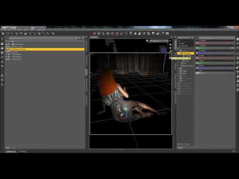
Here is another mentioned already but it is very good: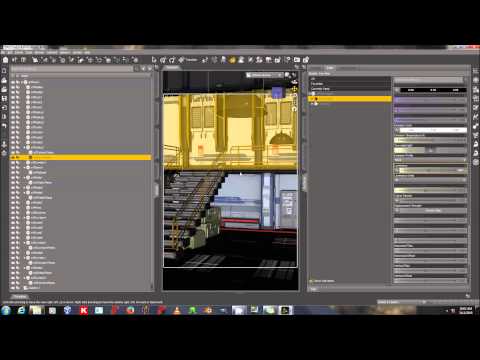
Thanks for the kind words :-) Yeah I have to admit, that the Bike is just standing (Cats do have a good balance, right ;-) ) I was more focoused on the Light and how all works. Later I hoped to add more effects on the Breaklight, and add some Waterdrops and Stuff,... Pose the Bike right ^^. But sadly the file is corrupted and won't load anymore. And currently I don't feel to recreate it.
I have had that happen. It is frustrating...and yes...cats are incredible at balance and I am sure she is more than capable of keeping that bike upright just the way it is.
This is a second take on the same subjet, for the intermediate challenge; changed the light to make it a bit "moodier" (maybe muddier? english is not my native language), so I used some atmospheric effects and replaced the point lights iluminating the background with colored spotlights + some floodlights at the top. Also I slightly changed the camera angle and poses.
Same as before, rendered in canvas and tone-mapped in PS, with some color correction done as well as bloom effect (which I found easier to control than doing it on DS). No lights or light effects added in post.
Hope you enjoy it!
Dancing In the Light (v2)
Very nice except i feel boy's right arm particularly his shoulder looks very disoriented. It gives me impression like its broken. I wanted to point it out on your first render too but i felt like my perception is not that good so i waited to see if someone else will notice.
just my point of view.
Here is my go at the intermediate challenge. I just posed CJ8 with a multiple light set up. I used something similar to a gobo for one of the lights. My attempt was to create a diffuser in front of the emissive plane, that would mimic a honeycomb grid you may see in a light box. Instead of creating a hexagon pattern, I used the voronoi noise in Affinity Photo to create the grid and apply the black and white image to the opacity parameter of the surface settings.
For those that are interested, I have included a second image of my scene setup. The main emissive plane is set to a luminance value of 20,000, with watts as the luminance units, 30 for the value of the luminous efficiency and emission temperature of 6,500 K. In front of that plane is another plane, just black for the base color and glossy color, with glossy weight to 0. The black plane blocked most of the white light, but allowed some light to reach the subject.
For the neon tube, it is a cylinder with an emissive applied. The luminance value is 1,000, with watts as the luminance units, 30 for the luminous efficiency and the emission temperature 0 K. I placed the grid in front of another emissive plane (luminance 500, watts as luminance value, 30 for the luminous efficiency and emission temperature of 6,500 K). The fill light is a spotlight with a spread angle of 20, light geometry set to disc, luminous flux set to 250 and temperature is default 6,500 K.
In the Render settings, tone mapping, ISO is 200, shutter speed is 1/200, f/stop is 4 and both burn highlights and crush blacks are set to 0.
I like the changes you made. The bubbles where a little distracting in the first version but they work well now. It definitely feels like a rave style party to me.
Thank you for showing your setup. You have achieved some really nice highlights and rim lights that help separate CJ 8 from the background. Well done.
Furtive Firekeeper Mk6
iRay seems to have difficulty with sub-1000k lights. If you look at her hands in the previous version, there's a pixelated patch of red. When I was prepping this version, I found that those went away when I raised the lowest temperature from 512k to 1024k.
Setup:
Thank you for your comments @TrisValentine . I took the pose from the "Expressive Dancer for G8 Male" product, and after a second take, I must agree that it looks a bit wierd. So I changed his pose (from the same package); this pose comes with an expression; I usually like to re-do the built-in expression and dial them myself, but I think this one fits the mood. I changed her expression too.
Unfortunately @Kismet2012 , the bubbles are back LOL. with a little less shine, though, courtesy of the default Water shader
Same as before, Tone Mapped and Bloom effect added in post (PS). No further corrections in post. All lights are "natural" to the scene. Also re-framed it a bit to follow the new pose.
Dancing In the Light (v3)
Thank you all for your comments. This one will probably be my last version, as my real life commitments prevent me from spending too much time on DAZ.
I quite enjoyed this challenge!!!.
@Kismet2012 - Thanks for the compliment!
Yes, I had just changed the background color to black, and you're right - it flattens the image.
As you can see, I tried to fix the issue by adding a brick wall AND curtains behind her (can we say overkill?). I also changed her hair to a more traditional bun, but added a costume-y decoration to make the image more theatrical. I definately like the hair better, but I'm more iffy on the hairpiece. I'm also having my doubts about the tutu ... I kind of love the contrast between the super-modern dance pose (from IGD Forms for Genesis 8 Female) and the traditional tulle tutu, but on the other hand I think the tutu is too large and overwhelms the dancer.
I didn't change a single thing wit the lighting. Amazing how much brighter everything looks!
It's still not feeling cohesive to me, so I'm going to mess around with it some more and see what I can do to fix that. Critiques appreciated!
@Sisyphus1977 - what a great image! And thank you so much for including the picture of your set up. I have zero background in photography, and I'm facinated by how people use such small studio-style vignettes in Daz. It's something I'd really like to learn how to do - both because of how success the technique is and because I think it would be much better for my computer than my current try-to-recreate-the-real-world style approach.
If you do a second version, I'd suggest tweaking her pose. The top half of her body seems oddly static when compared to the rest of her image. I think part of the problem is that her torso is over-rotated. I think you could untwist her by 5-10 degrees and get a much more natural looking pose without losing any of the muscular definition that your lighting shows off. Rotating her bottom half might actually work better than rotating her top half. That way you can keep the framing of her face and shoulders. I suspect it would also make the lighting on her rear end a little less noticable. Right now, I find the bright rim lighting on the lower half of her lower half (I hope that's a forum-appropriate way to say it!) a bit distracting, although that may just be personal taste. But I do think your lighting makes her abs the star of the image - so if I were you, I'd let that be the focal point of the composition.
So. Am I entered? There didn't seem to be an entry thread.
any way, I am wanting to be entered in the Feb beginners chalenge. Learned a lot doing this.
You guys are achieving some really amazing renders here.
Here is my first try at this, as I am pretty bad at lighting.
Would appreciate any advice to improve upon this.
There is an elegant simplicity to this image. She looks so peaceful.
I found the bubbles a bit distracting in the very first version of this image. Now they are adding some dynamism ( that's a word right? ) to the image. I can feel the pulse of the music and the strobing lights as they dance.
I like the changes you made. I am not sure the red brick wall is helping. Is she on a stage performing in front of an audience? Is she in a dance studio practicing? The brick itself might not be the problem. It could just be the colour.
Can the tutu be scaled down slightly so it does't overwhelm the dancer? Although I have seen these really big, stiff, gravity defying tutus on ballerinas.
We do not have a separate thread for entries anymore. Participating in the thread is your entry. Unless the image is specified with an NAE (Not An Entry) designation.
Welcome to the New User Challenge @alex86fire.
First thing I noticed is her foot and the tips of the feathers on the left wing is intersecting the floor. You need to either raise your figure, which is throw off your lighting, or you can lower the background set.
Are you using a single spotlight over the figure as your lighting source? Are you using Iray or 3Delight?
The overhead spotlight is giving some really nice rim lighting and helping to separate her from the background. Perhaps a soft spotlight coming from our right focused on her face will help to reveal her features. Just enough light to help soften the shadows but not lose them completely.
Thank you for the feedback, much appreciated!
Regardng her foot and tip of the feathers, it was by design that way. She is in a sewer and that is sewer water she is in. Maybe I need to add something to the water to make it more believable, I just loaded it from https://www.daz3d.com/the-murky-sewer .
I am using Iray and have added a spotlight above the figure. It is meant to be representing the open sewer grate above her, bringing in light from the outside world.
I have added the spotlight to the right, focusing on her face. I have toyed with the lumens to get a nice result but I didn't touch the intensity or beam xponent at all as I didn't really understand what they do. I also didn't touch the two sided feature.
Beginner Challenge: "Lighting"
Image title: He thinks he is a pop star!
Software used: Daz Studio 4.12
Photoshop for PNG -> JPG conversion
Never entered a competition on the forum before.