Adding to Cart…

Licensing Agreement | Terms of Service | Privacy Policy | EULA
© 2025 Daz Productions Inc. All Rights Reserved.You currently have no notifications.

Licensing Agreement | Terms of Service | Privacy Policy | EULA
© 2025 Daz Productions Inc. All Rights Reserved.
Comments
MB Box [THIRD EXPERIMENT]
Added more elements to guide the eye and further softened the DL shadows...
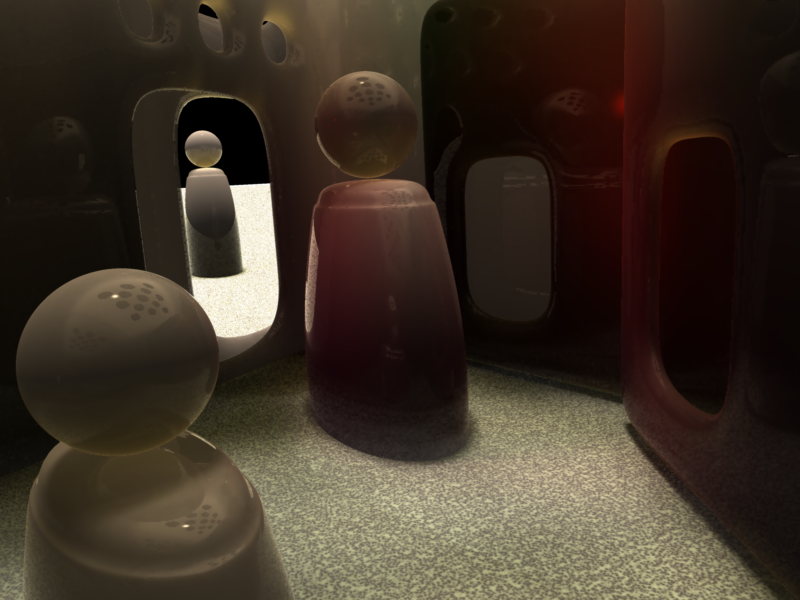
Changed DL direction and added MB Box
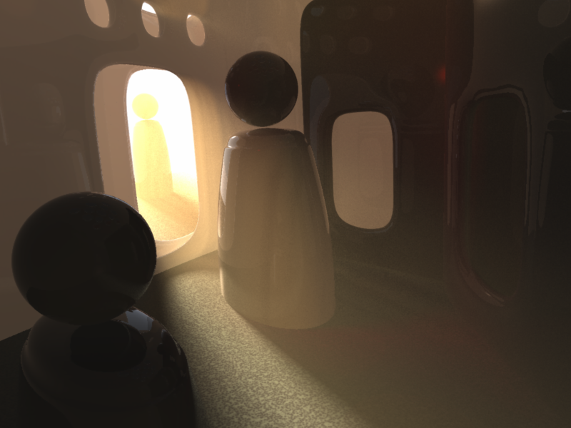
~ And , looking good so far , ~
Pardon me. My entry requires a setup story. It will illustrate how oddly my mind works. :)
When I was a kid, I watched a black-and-white science fiction movie on TV called "Robot Monster." I only saw it once, but it was unforgettable. The "monster" was a guy in a gorilla suit wearing a diving helmet, with a TV rabbit ears antenna welded onto the top. He was supposed to be from the moon. The director seemed intent on throwing as much stuff on the wall as possible, in hopes that something would stick. The movie even had dinosaurs, but nobody explained exactly why.
I saw it back in the 60's, before there was such a thing as "best-worst movie." It just seemed awful. Only later did I realize its greatness.
Here is the original trailer:
At the end of the trailer, the movie was described as being "Overwhelming, Electrifying, Baffling." Baffling it was.
I started thinking about Robot Monster again after Headwax announced the Challenge theme. The first thing that popped into my head was "lights, camera, action." It suggested a movie production scene. But what movie?
At the same time, I was doing a render of the original The Girl. For some reason, I put her in a space suit. It triggered an association with Robot Monster, and in a flash of inspiration, I knew that a sequel to that magnificent catastrophe of a movie was needed in order to restore balance in the world.
Lights, Camera, Strangeness! - The Sequel to a Movie Classic
In the original Robot Monster movie, the lead actor was hired because he already possessed a gorilla suit. That tells you all you need to know.
In this render, the gorilla actually was one - the Millennium Gorilla LE, augmented by Carrara hair. Love that Carrara hair!
The director and the clapboard holder are both Michael 3. The guy in the dinosaur suit was David 3. Space Vixen was played by the original Girl body, with the head from a Genesis 2 figure (Ambie).
Vyusur created the dinosaur (Dino). A wonderfully versatile model. I made it look more plastic and dorky than it really is.
Most the the vintage studio equipment came from Nikkelah's Vintage Movie Makers. The old mic and boom was a Carrara native object.
The weird robot helmet was the real deal, brought into Carrara via a Philemo cutout/blimp. Philemo's program is so underused.
As for lighting, I used a small light cone, but not anything unusual or adventuresome. However, lighting was very important. Several rim lights were included to add drama.
No postwork.
Very nice, love the people figurines !!
Excellent, a feast for the eyes, nice homage to the movie with the poster on the wall !!!
Nice Misty !!!
How's your Carrara work schedule looking ?
~. alrite , so far .~
~. +1 agree .~ nicely done ~
Comments - I have gotten far behind. Hope no one minds if I go in reverse order.
- ed3D - nice pipe modeling. Thanks for posting the scene screenshot. Looks like a robot needs some rest. Also like how you labeled your lights with colors. I should do add that to my light names.
- UnifiedBrain - Oh my. I have seen that movie. In my youth, there was a local theater that once per year offered a night of Golden Turkey Awards. You didn't pay to get in. You paid to get out! The longer you stayed, the less you paid to get out. They put together a marathon of movies which included Robot Monster. If I remember correctly, one money saving device they used was that if people left the compound, the alien robot monsters would find them if they spoke. So people used sign language outside the compound. No need to sync sound to the mouth movements! OK, dumb trivia aside, you have put together another great image. There is nothing more B-movie-ish than a gorilla suit topped off by a deep sea diving helmet. Bravo!
- Fengari - beautiful lighting and beautiful shapes. The soft shadows and volumetric lighting compliments the rounded shapes. Simple yet stunning.
thanks.
i feel like he needs a heavy metal guitar. think i have a marshal amp prp somewhere. mebbe waa in my merlin folder
- Bunyip - thanks for the comment on mine. Good suggestion about the cross.
- Misty - I like the vibrance and the color choices. Cool reflections. Fun posing of the wacky models.
- Stezza - Catoon and Wacky Rabbit should have their own shows! Oh, wait, maybe they do. Excellent Carrara hair creation for Catoon.
- Bunyip - Dragon - nice adjustment on the dragon with the kick light. Really enhances the image.
- Vyusur - the volumetric light scene is just amazing. Wow! And just two lights? Marvelous.
- Bunyip - underwater - excellent application of the renderman effect. Light gels very convincing. Another good one.
- Stezza - Old Fella - very convincing facial hair. Can I ask if you do another video tutorial, you consider a topic of Carrara hair for toon characters?
- Freelight - welcome to the challenges - excellent city scene. I especially like the integration of multiple lights with limited range, icnluding the car headlights, street bulb lights, and building light. Well done.
- SciFi Funk - love the expression and hand gestures! Convincing storytelling. Thanks for the detail on the light setup. Very informative.
Sorry if I missed anyone.
@FENgari - Third experiement version 1- that really is looking the business, you've got element interest, multiple light elements/shadows to consider plus the main texture is really starting to sing now. congrats.
@UnifiedBrain - Perfect comic book look!
@Diomede - Thanks. Also I deliberately tweaked the nearest hand position so that it's shadow fell plum on the pillow.
~ thanks very much ~ the " Pipes " _ Are part of the Bed
~ labeled lights with colors _seemed the Logical thing to do ~
These images look great everyone!
I have to come back later to make more specific comments, very behind here. I have two ideas for an image but got side tracked today by attempting a fake Bloom effect. I was watching an interview last night online and was struck by the light bloom from a window from some back lighting and made an attempt in Carrara.
I made a basic room with some shaped windows, then copied the geometry of the windows and broke it out as a separate object and placed it in front of the windows. I textured the object with a Color Gradient in the Glow Channel and used a texture map, slightly blurred, as the Shader. I also gave the same object a Transparency of 80% and a Highlight value of 49% to play with Glare (Scene > Filters > Glare). Video explaining Glare, Aura and Blur from legendary Carrara artist Cripeman here:
Also added Aura to the object under Effects > Aura. And then added another bulb with Glow and Cross Screen effects to emphasize I don't know what I'm doing.
Also added some Fog as per Wendy's suggestion but it's real subtle. First image has Glare, second has it turned off. It is also real subtle, don't know if it adds or detracts.
that's all I can say
hmmmmm.... there's a thought ...
a model from a store or something else in particular?
either way it'll end up being made up as we go lol
Iran so far away but still scary
Bunyip, ed3D, Diomede, Sci Fi Funk - thanks for the comments!
Diomede, you definitely have a classic scene going. It looks like the box is going to work, even though it will probably be squirrely to work inside it.
FENgari, I hope you decide to enter something. :)
Misty, great to see you posting renders again. Cute Mascara. Yep, he needs a guitar and amp.
ed3D, I'm unsure where you are going with the bed render, but it looks interesting so far.
DesertDude, always look forward to your work, hope you can enter this time.
Very cool, looking forward to seeing the finished render !!!
Looking forward to seeing where this leads !!!
~ Thanks , if it's Interesting _ then , that's good ~
Thanks very kindly
IRONY!
I thought I'd try something different - a cartoon style image (not my usual take) with a touch of irony... First I needed to decide on what the irony was going to be based on; the classic comic sci-fi machine v man theme perhaps? Yes, that'll do!
Now I needed to model the two protagonists; a stinkhorn mushroom (representing man' 'stenchful' virility) and a bland humanoid robot... The first image follows showing the basic stage with a fairly flat sky courtesy of primavol for the clouds.
A further model added for roads and more stinkhorns...
Spheres added and a spot light to add atmosphere to the clouds...
Second protagonist model added...
Finally, Caption added and GMIC filter (click to see the bigger picture)...
All shaders are procedural, no postwork and subject to radical change...
Very nice picture came out. Dramatic in the whole, volumetric effects and shadows are excellent.
Thanks a lot!
@FENgari - Really nice image. Thanks for showing the breakdown. The composition is well thought out. The added Caption, choice of font and GMIC filter turn it from a piece of 3d art into a true comic book frame. Very good work.
+1
My thanks to:
Sci Fi Funk on Youtube - glad you like the experiments. I've not been on here for ages - so just messing about really to "refind myself" with Carrara. A great programme that can still hold its own!!! I like the story telling in your image and the attention to detail - something I'm not so good at ;)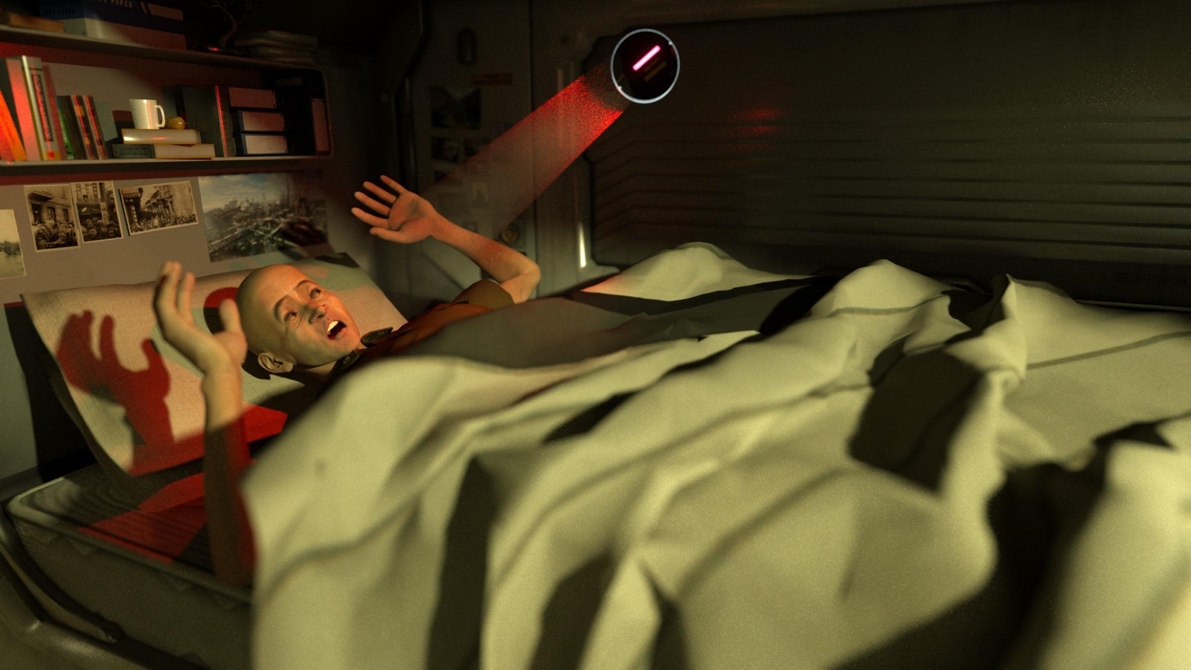
Bunyip02 - great to receive your encouragement, loving your sunset lens flare, colour scheme and realistic dragon pose.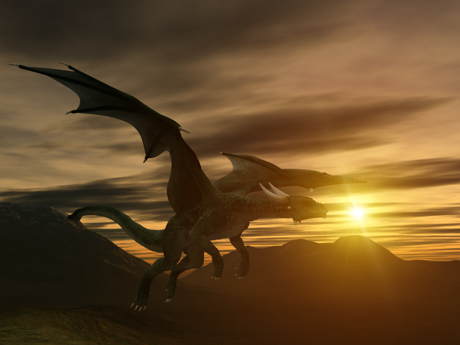
ed3D - keep up the good work, you're off to a great start!
UnifiedBrain - great use of saturated colour - the yellow really pops!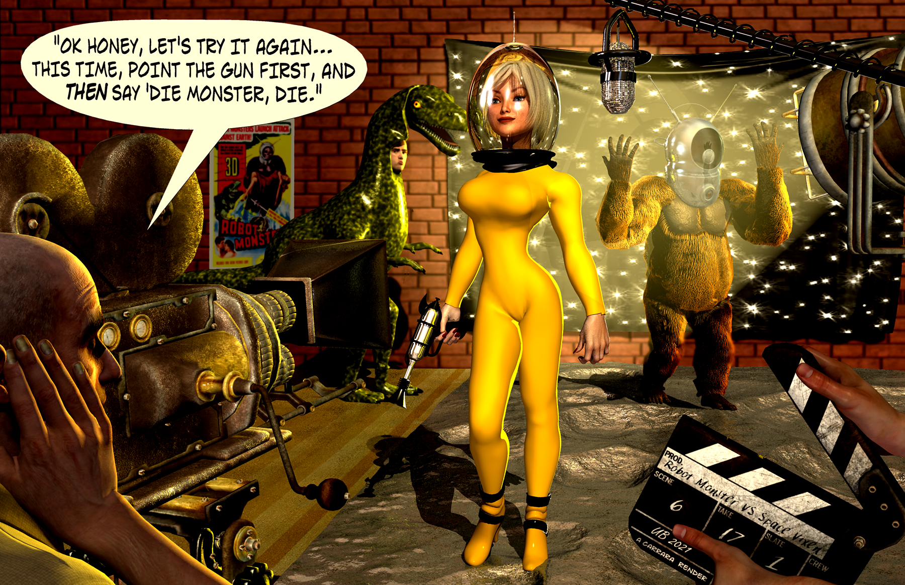
Diomede - just adore the pose of the dying vamp.. such an emotional impact... I can see that you've gone from strength to strength with adding life to your characters - just magical.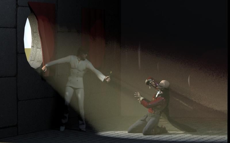
Dartanbeck - a staunch advocate of all things Carrara; glad to receive your comments!
+ 1 ~ agree ~