FirstBastion Sightings [Commercial] sort of
 FirstBastion
Posts: 7,844
In case it's not obvious, PAs really enjoy seeing their content getting used in works of art. And I have to admit, I'm no exception. There's something very rewarding seeing the results of someone with some serious talent taking something that I made and bring it up to level of art. So I'm starting up a thread here, when I stumble on an image I'll post it, the artist who made it, and the link to thread. And hopefully others will point these out me and or post images too.
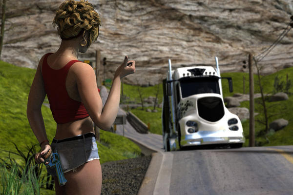
This first one in the PC member's area by kimreb55th, and it's called Truck Jacker.
It also happens to be showcased in this week PC Newsletter which was the impetus for this thread because it is an awesome image, using Rural CrossRoads.
http://www.daz3d.com/forums/discussion/27555/P30/ ( link in PC member's area of forum so not everyone will have access)


Comments
I've bought most of your environments to use in the future, and have already used a couple.
Neighbour's Yard, for example, was used in a 10 page scene for a graphic novel being published next year, entitled The Game.
I also briefly used Flight of Stairs in a graphic novel that was published just this week, entitled Peaceful Tomorrows (vol 2), but don't have a preview image handy for that one.
I've also got some set-in-stone plans to use Spiral Descent Cave Entrance and Cliff and Climb in some graphic novels I currently have on the go.
I'm not sure this one lives up to your Title of Art but I'll post a link and let you decide if it fits. If you like fill free to Post it here. I'm a big fan of your sets.
http://www.daz3d.com/forums/discussion/27391/P15/#413677
EDIT: Here is the Full render and the TEXT. As FB noted below it is a Kit Bash of two sets.
As Promised…. Kit Bashed set. Using Firstbaston’s The Steppes x2 parts of Spiral Decent and different plants from LisaB.
Title: Watching for the Spring herds.
http://www.youtube.com/watch?v=FTBjLVxb_n0 this one definitely not art
...not totally up to the two posted above, but I do find your morphing terrains indispensable
This one used Rolling Plains twice, one in the background and another behind the camera to have something to catch in the car's reflection.
Learning how to Fly
There's always been these long discussions about ART in forums, but to me, most simply put is, ART = Creativity.
This has got to be one of the best gigs in the world, everyday I get to check out people's art and creativity. It's a good life.
DAZ please get those new galleries up very soon.
Shane, I've always had a soft spot for indy comics, and I really like the clean minimalist style you posted. Show us more.
Jaderail, great example of the mix and mash it up these set are designed for. Add the image in your post.
Wendy, quirky for sure, but certainly ART too, and all those subscribers following you, proves it. You have a style, and it is a recognizable unique style, which means it is an artistic style.
Kyoto, I always like pictures that tell a story, a snap shot of life. I like the word indispensable too! Exactly how these sets were intended to be used. They help fill up the frame in the background, give your renders distance and a sense of space. I remember seeing an image in the PC that used either the plains or hilly surround to emulate the French Country side. Can't find it though, think is might have been scorpio64dragon.
edit for grammar fix and spelling
Here is one using the latest set (posted in the PA Sale thread.
...thank you.
To show just how versatile Rolling Plains is, here's one I did using the sand texture with a combination of the dune and dip morphs to create a tropical beach scene.
Great stuff, everyone...
I recently spotted a couple of FirstBastion products in my Product Library for the first time... ;-)
Maybe this isn't great art, but given that it started yesterday as a simple test render (and my first effort with a FirstBastion set) I'm rather pleased with how it turned out. It does have some issues, but least it works as a proof-of-concept--and hopefully, proof of how cool the set is.
I used High Cliff Crossing with its default light set. I rendered it twice: once in 3Delight and once in LuxRender (Luxus), and layered them together in GIMP (Lux render on top, mode Overlay). Added some other effects in GIMP, Fotor, and FotoSketcher for a warm, watercolor-y look.
I also wanted to point out this render by SereneNight, which sold me on Hilly Surround. I just love unconventional uses... :)
...just picked up Hilly Surround during the PA sale so now I can do English Countryside scenes.
Totte, nice one, Raiders is one of wife's all time favorite films, so to have Indiana Jones tomb raiding one of my environments is pretty cool.
Scott, I really like the look of that, your composition on the camera angle is very dynamic, with the Z and the diagonals. LuxRender sometimes renders very flat, using the double render technique to overlay and punch up the depth is a great idea. I think the filters work well on that too. Also thanks for linking Serene's Hilly image, I hadn't seen that one, it's great way to use it; I also like the dive angle of the camera, maybe she'll add it in here too.
Kyoto, thanks for pointing out the versatility, that's something I always try to add in if possible. Is that the Tramp Steamer in the background? It fills the horizon well, I've been looking to pick it up.
Speaking of English countrysides, I had another look for Scorpi64dragon's image: Last of the Summer Wine Also in the PC memebers area. It uses Hilly surround along with some custom made fields. I like the sense of vastness.
http://www.daz3d.com/forums/discussion/7450/P105
I think I've got more indy on your environments, but that was my first though when I saw it!
...thank you and yes it is. For the smoke I used Nerd3D's Smoke N' Flames tool. The water disk is from his Waves on the Beach (which is also morphable).
Last of the Summer Wine is beautiful.
That is one of the looks I need as a major portion of the story is set in rural England (still need to find a good manor house). Have to figure out how to get those hedgerows, but not really all that good at modelling. Would be nice to have other morphing scene props like stone walls, roads/paths, and hedgerows, that could be used with the terrains.
Here is one that really pushed a few boundaries. Again Using Rolling Plains but adjusted the opacity channel and used a water plane texture to create the look of rolling swells. This was done a couple years ago for a DCC challenge on DA.
Title: La Cathédrale engloutie
(Inspired by the piano work composed by Claude Debussy of the same name)
I'm not sure if you seen this Animation I did or not.
but i used your "high cliff crossing" model in it during the escape scene.
I really enjoy using your models in my animations they render great and work easy in animation
anyway I hope you enjoy the animation
Cheers
https://www.youtube.com/watch?v=6K_xGxBb0GE
...nice work. Loved the scene where her "passenger" getting tossed in the loo during the pull out manoeuvre.
Yep, she's the best.
Breaking Waves with a few mermaids (just playing with new purchases for the PA Festival render thread) - postwork with some Ron's Waterline/Ron's Water to add some extra splashes.
Thanks for your interest! I don't want to hijack this thread with tonnes of spam, so I'll just mention that my website (http://shanewsmith.com/) contains a gallery page, book trailers (with plenty more art), and info about all my published graphic novels and WIPs.
For more preview action, the Amazon listing for my first book (The Lesser Evil) contains a free preview of the first 30-50 pages (from way back in 2009 when I was still working the kinks out of my style): http://www.amazon.com/Lesser-Omnibus-Graphic-Novel-ebook/dp/B00EG3X5C2
Thanks again - keep up the great work, and I'll keep sending you money!
Another sighting. This one is in the PC member’s area by Bohemian3, and it’s called Tunnel Out, and was in the render contest thread titled "Escape" http://www.daz3d.com/forums/discussion/17981/P15
Who knew Stonemason's Mech enforcer would fit inside Storm Sewer Runoff. Cool!
It's been a while since I posted a sighting. But I was truly wowed by this as I was perusing the brand spanking new DAZ galleries today. My first thought, Hey that looks familiar. It an excellent image titled "Into the Unknown" by Szark using Walk Across Water and Stonemason's Winter Kingdom ruins. Another example of the Let it snow shader enhancing an environment.
Original image is here in the gallery, http://www.daz3d.com/gallery/images/5997/
Spotted this every atmospheric deep space exploration image by SimonJM that's quite promo image worthy, showcasing both Arctic Research and Midnight_Stories new M6 Spacesuit. Love the lights flares and the mood. It's cold out there. Very cool! http://www.daz3d.com/forums/discussion/18493/P150
Wow, thanks :)
I ran across this re conceptualization of the Gallerie Bastion Spacious Interior by Doctor Jellybean in the DAZ Galleries, into a livable mansion complete with exercise area, grand piano, and fireplace. Great reflections and surfaces. There's even some great art on the walls!
The full size version is in the DAZ gallery here: http://www.daz3d.com/gallery/#images/8137/
I saw this little gem using Walk on Water in one of the members area contest threads by Totte, who is very creative. Having rented the entire 1st season of Vikings Series I like this. Here's the link to thread: http://www.daz3d.com/forums/discussion/33300/P105 for the full view of the image. I really like how the fog fills in the distance.
This was a quick render for my husband a few months ago. I used your very useful 'Useful Mirrors' on Petipet's 'Ranger' and the plane, and placed it all into one of flipmode's Easy Environments.
...makes a nice car advert.
Okay I have to admit I've seen this one before, way back in the past, but I was looking back through the old archives for something else, and stumbled on it again, as if for the first time, It's an image by flashback37 using the Gallerie Bastion spacious interior, and its still a cool image sighting. Full size over here. http://www.daz3d.com/forums/discussion/292/P51
LycanthropeX also use the Gallerie Bastion in a very creative way during that same timeframe.
I just posted in this thread http://www.daz3d.com/forums/discussion/35100/ 3 different images i did with that set as an example of how to use models for more than what they were intended for
Gallerie Bastion Spacious Interior has been one of my favorite sets to work with, there is just so much that can be done with it. I have a lot more renders planned for it to come
...and a little kitbashing can make difference too.
Unfortunately not right to show the examples I have here as they involve products by other PAs.
I saw this the other day, using the Desert Road and Gully environment set, it was in the emailed newsletter, so it was probably done by one of the DAZ promo artists, but unfortunately I don't know who to give some kudos. Good post apocalyptic feel to it ala Badlands or Rage or Fallout, if people know those games. There's supposed to be a new MadMax game and movie in the works so inspiration coul come from there too. There's was a bigger version of it, but I'm not sure of the link. http://www.daz3d.com/newsletter/2014/special/02-07road/main-promo.jpg
This ones kind of fun which I saw in the DAZ Galleries by Shane Smith, Spartacus vs. Minotaur, a very "what if" mythic scenario set at the Dungeon entrance, with a really good "Kirk Douglas" face morph to boot.
http://www.daz3d.com/gallery/#images/20835